Mates Brand 360-degree brand creation
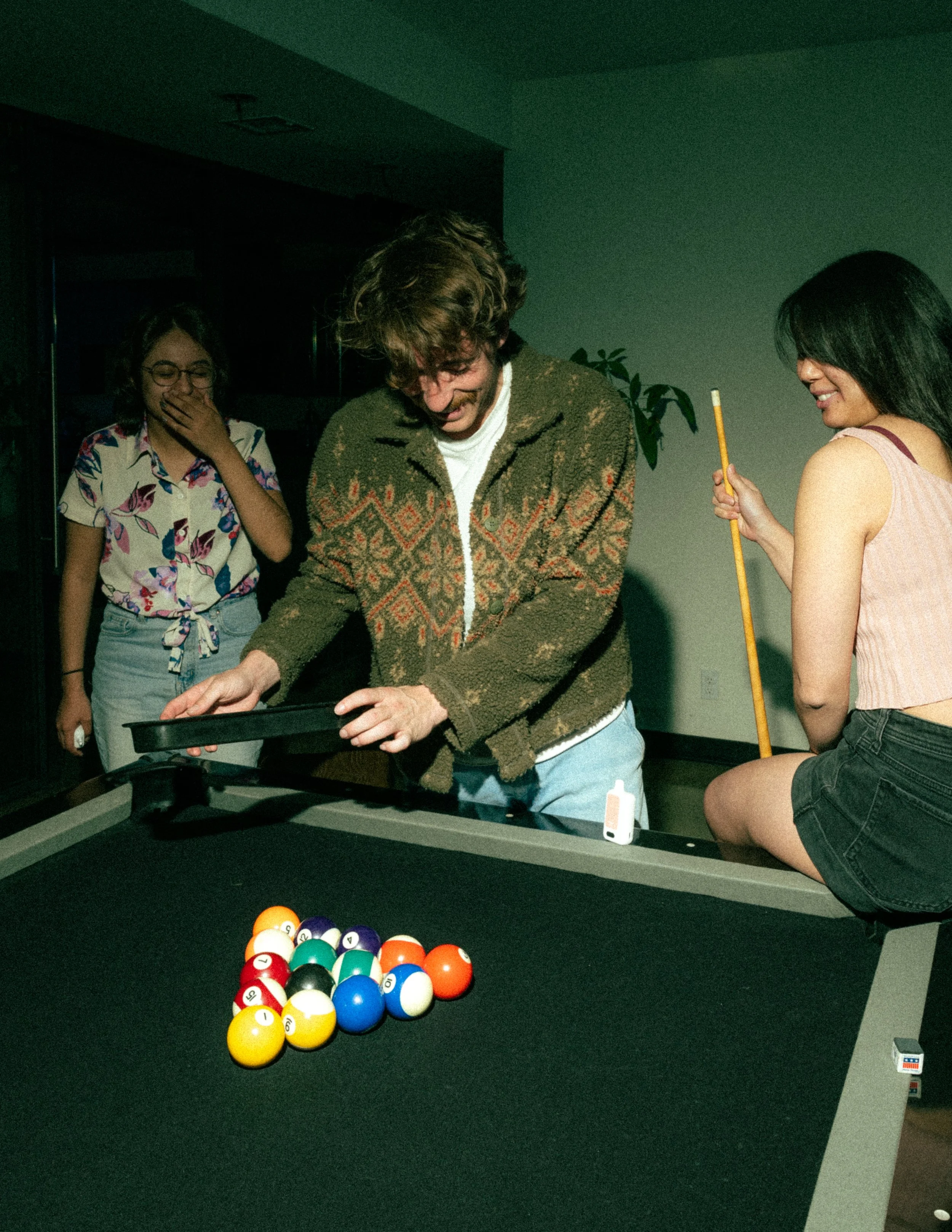
Mates Brand is a nicotine-alternative company created to help people switch to better options than smoking. As Project Lead and Designer, I led every aspect of the brand — from concept and product development to visual identity, packaging, and launch strategy. The lineup includes ClickMate (eco-friendly pod system), LiqMate (e-liquids), PouchMates (nicotine pouches), and MintMates (nicotine mints). With over 30 bold flavors and a cohesive design system, Mates Brand generated over $8 million in revenue.
YEAR
2023
PROJECT DURATION
5 MONTHS
Naming Story
The name Mates came from a simple idea: this product is always with you. Whether it’s in your pocket, your bag, or your hand it’s your go-to, your backup, your ride-or-die. We wanted a name that felt personal, casual, and dependable like a friend that’s always there when you need it. That’s how Mates was born. Because when you're trying to quit smoking, it helps to have a Mate.
Research.
Before building Mates Brand, I dove deep into the smoking alternative market — studying user behavior, competitor offerings, and emerging trends in nicotine consumption. I noticed a common theme: most products were either too clinical, too flashy, or lacked personality. Users wanted something that felt personal, modern, and trustworthy — not another disposable product with a throwaway vibe.
Brand Identity
Color
I chose white and black as the core brand colors to keep the identity clean, modern, and versatile a neutral canvas that feels premium and allows the product to speak for itself. It gives the brand a timeless, minimal feel that stands out in a space often flooded with loud, cluttered visuals.
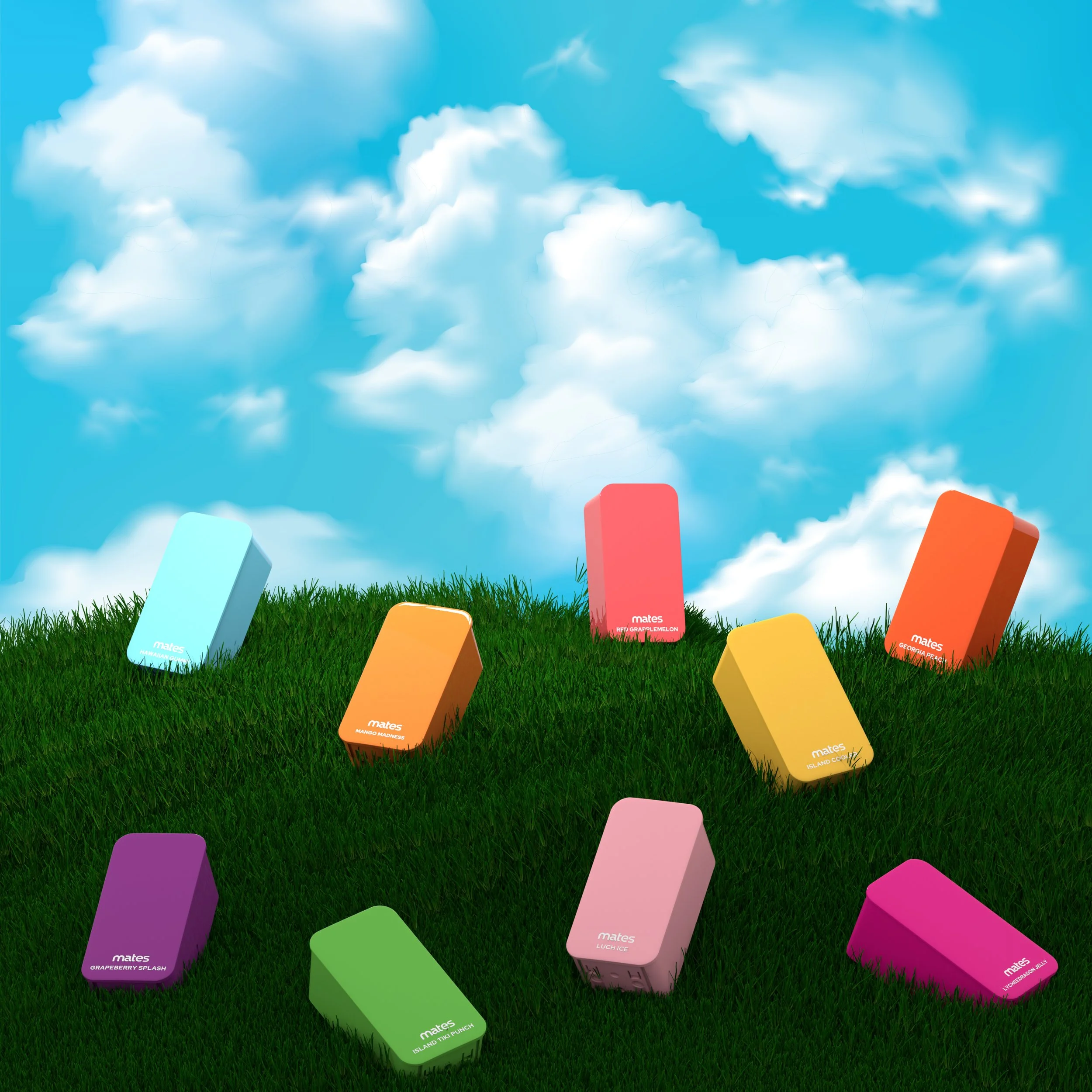
For the products, I used vivid, bold colors to reflect the personality of each flavor and make them instantly recognizable. The contrast between the neutral brand aesthetic and the bright product tones creates visual impact on shelves and online drawing attention while still keeping the overall look sleek and cohesive. It’s a balance between clarity and character.
Typography
I chose Red Hat Display as the primary font for Mates Brand because it strikes the perfect balance between modernity and friendliness. Its geometric structure gives the brand a confident, clean presence, while the subtle curves keep it approachable
To give the brand a unique identity, I designed a custom logo inspired by the font but refined for stronger recognition and visual balance. The custom lettering helps Mates stand out in a saturated market and reinforces the idea that this isn’t just another generic vape brand it’s your Mate.

LOGOS
-

MAIN
-

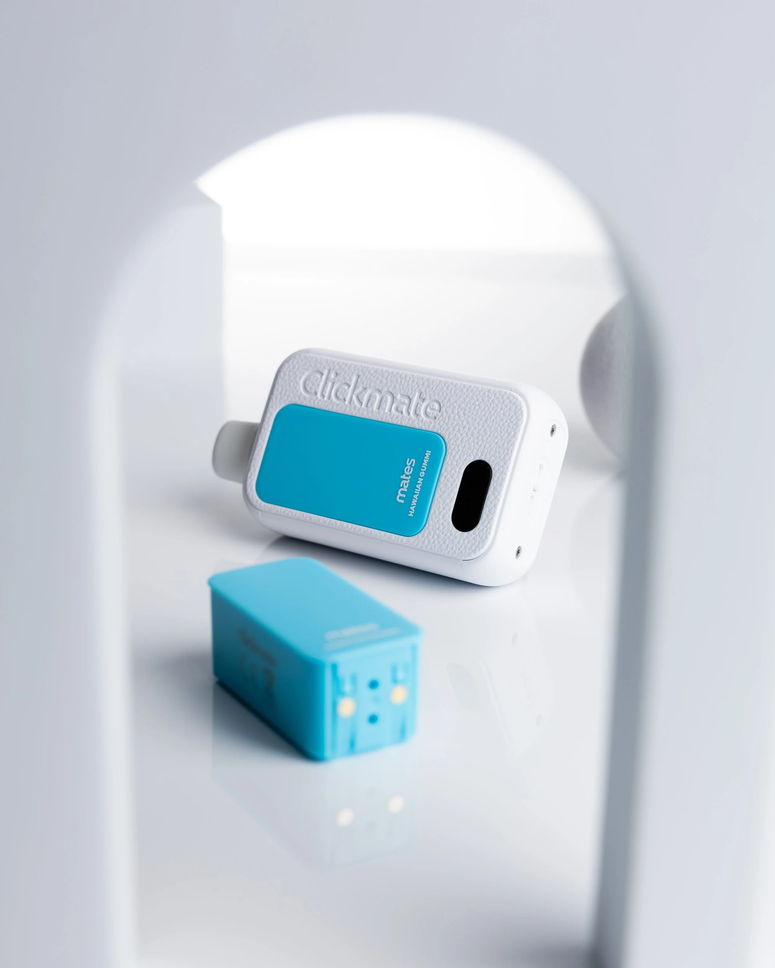
CLICKMATE
-

MINTMATES
-

POUCHMATES
-

New List Item
CLICKMATE
-
![]()
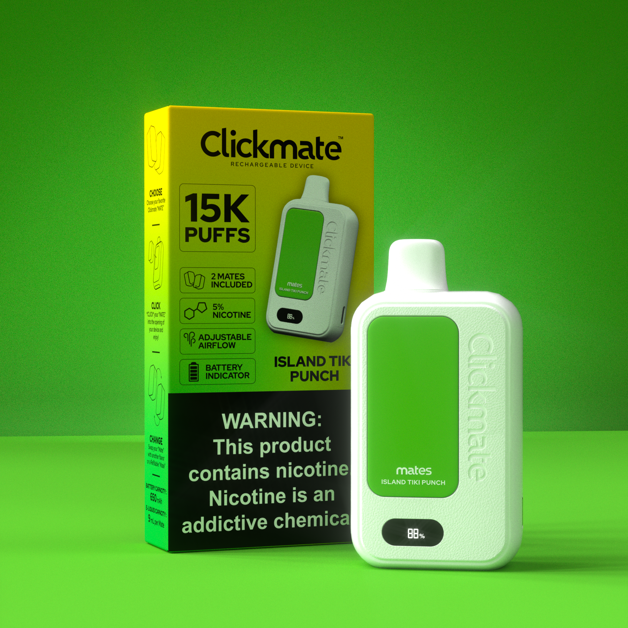
ISLAND TIKI PUNCH
-
![]()
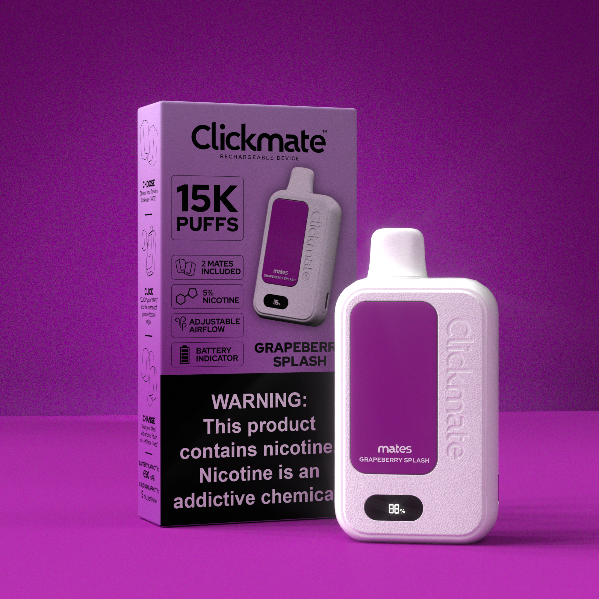
GRAPEBERRY SPLASH
-
![]()
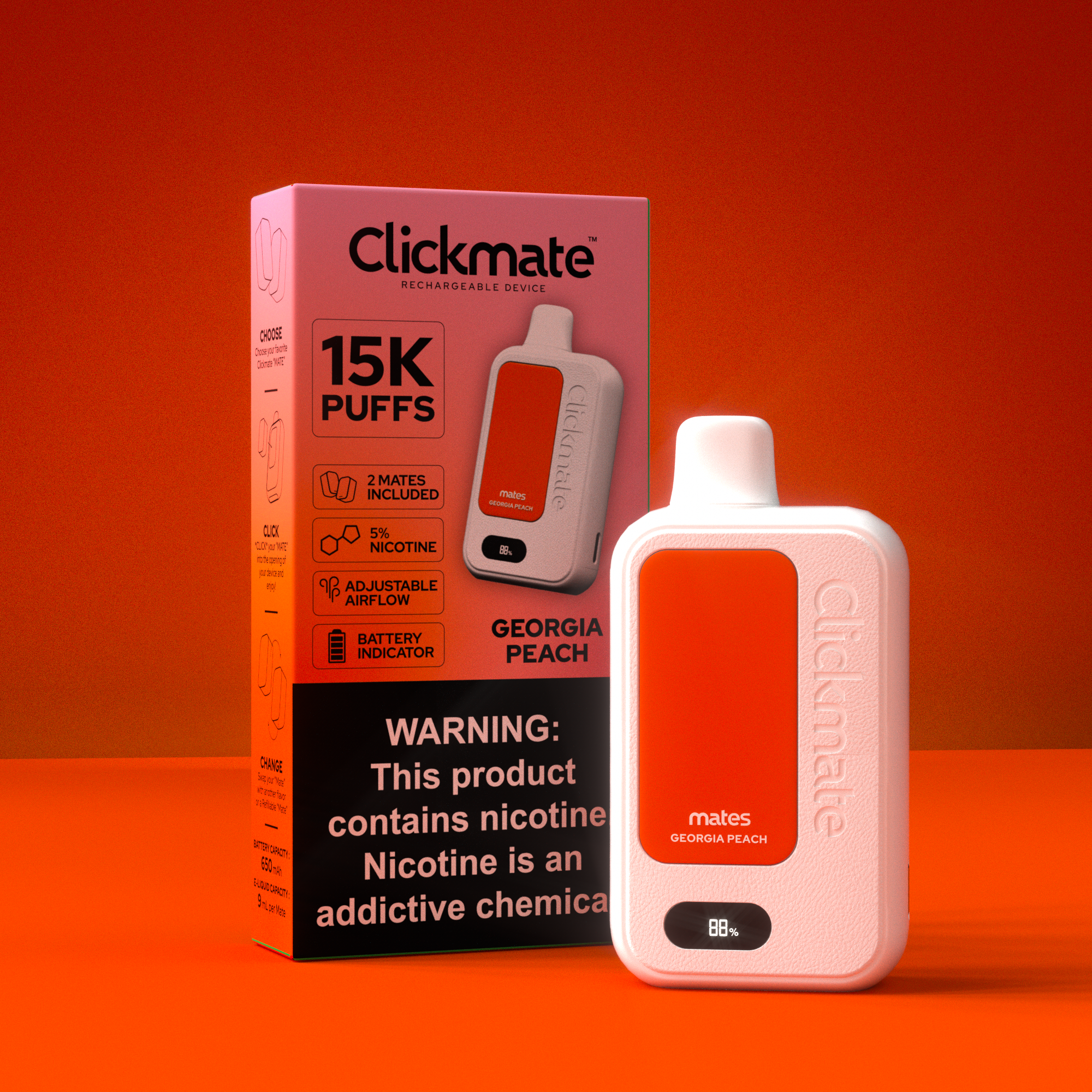
GEORGIA PEACH
-
![]()
CLEAR EMERALD
-
![]()
CLEAR
-
![]()
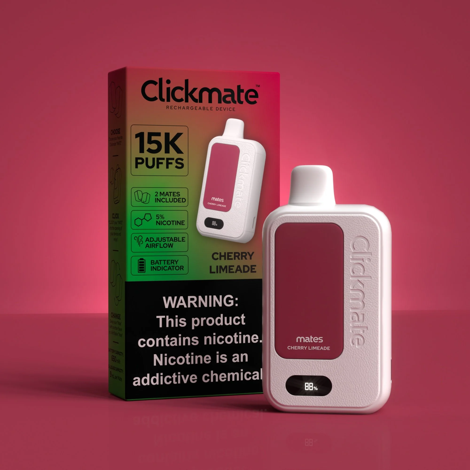
CHERRY LIMEADE
-
![]()
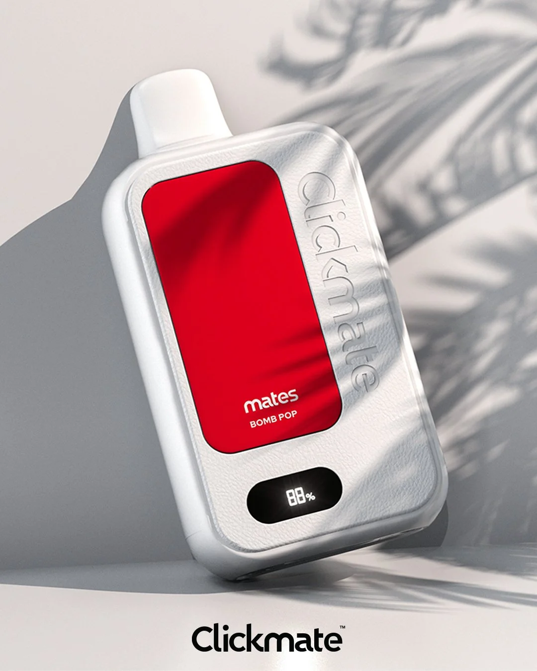
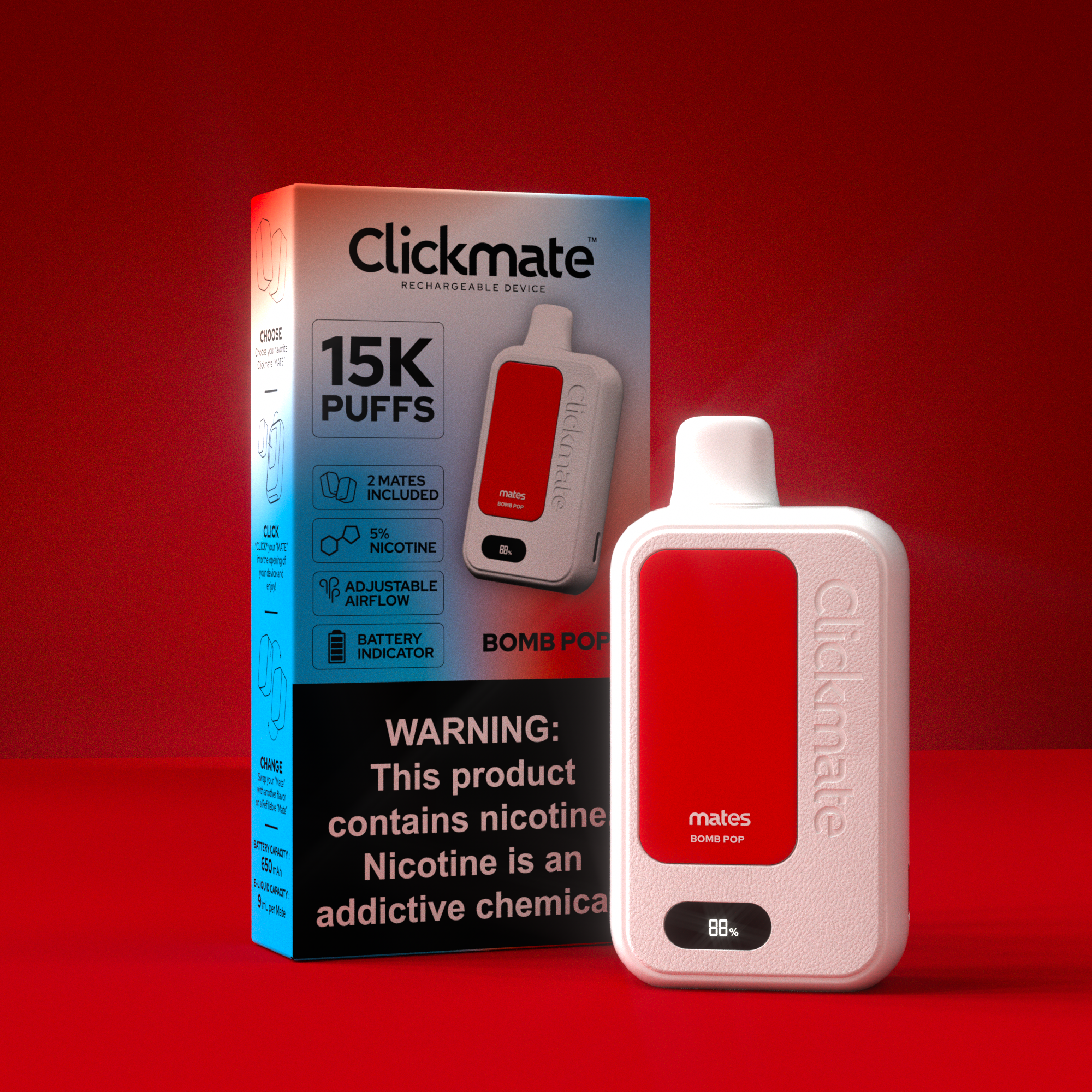
BOMB POP
-
![]()
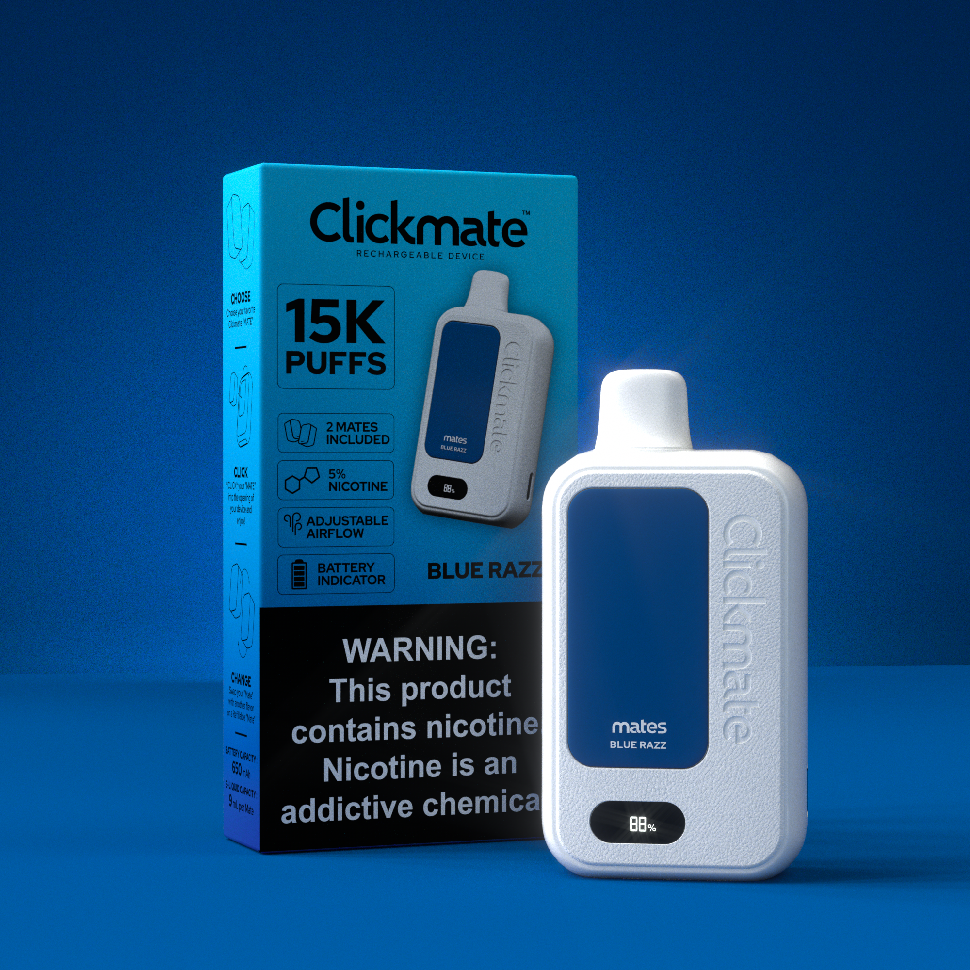
BLUE RAZZ
-
![]()
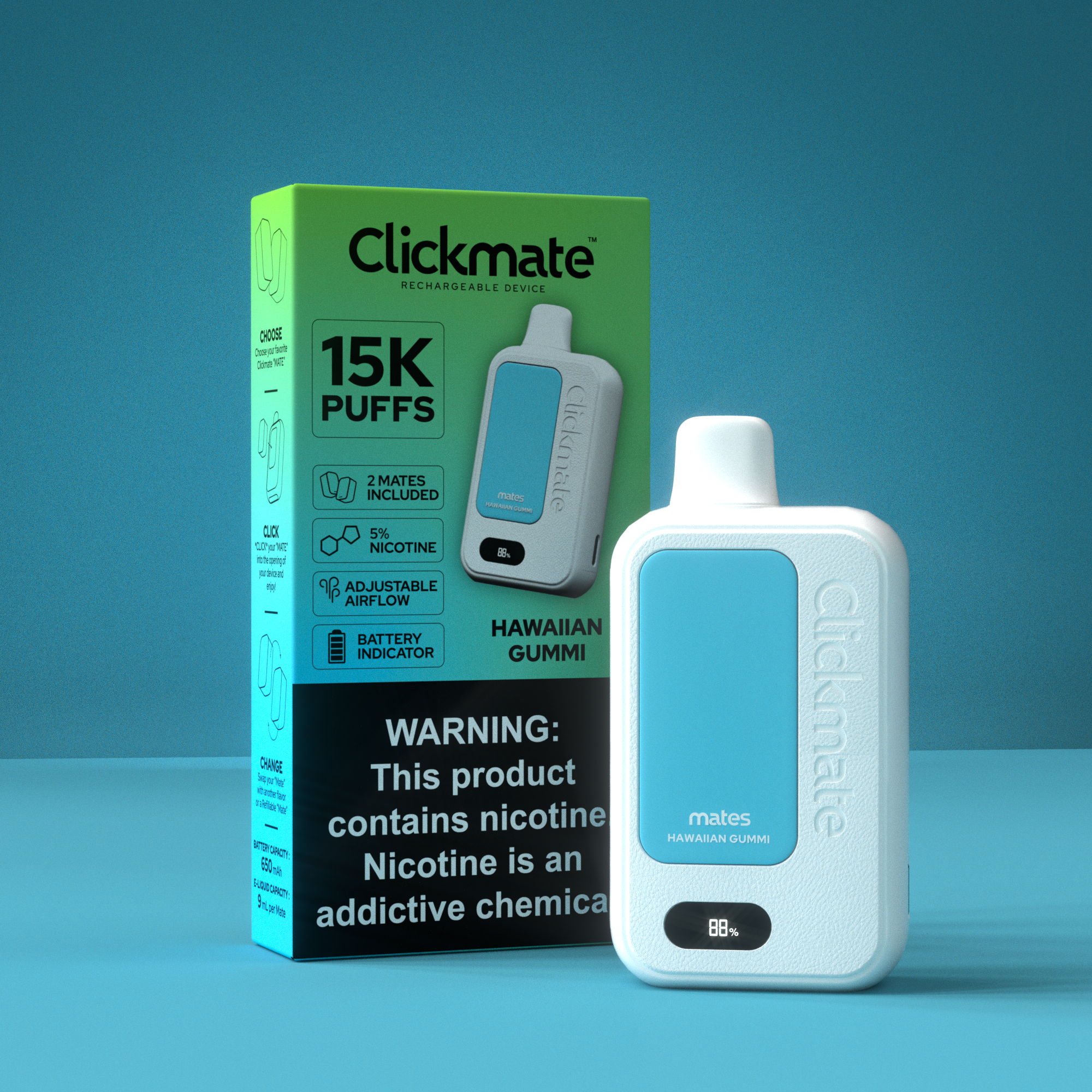
HWAIIAN GUMMI
-
![]()
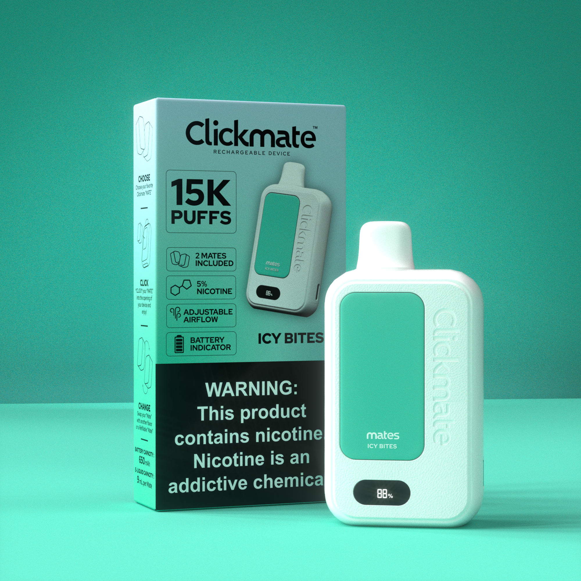
ICY BITES
-
![]()
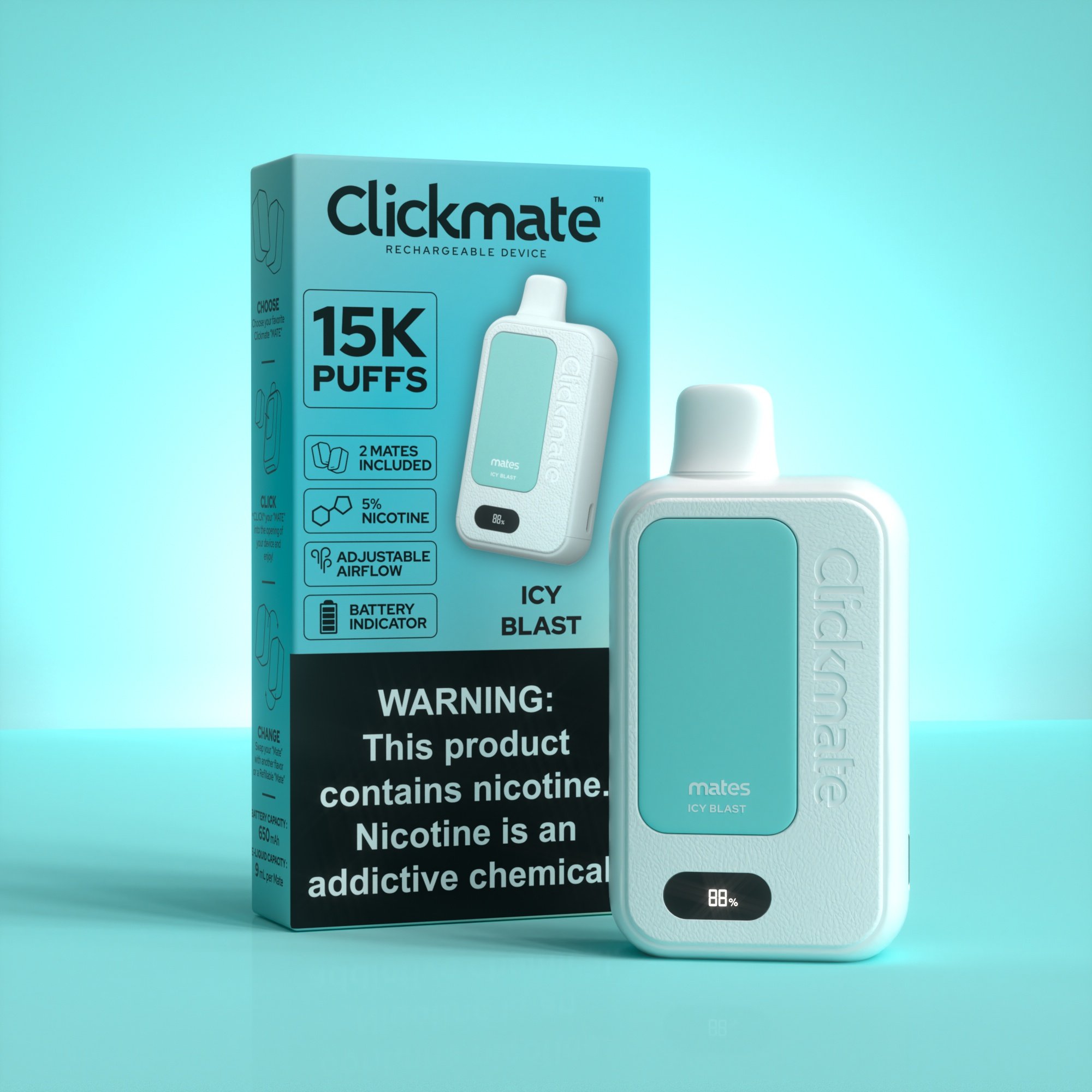
ICY BLAST
-
![]()
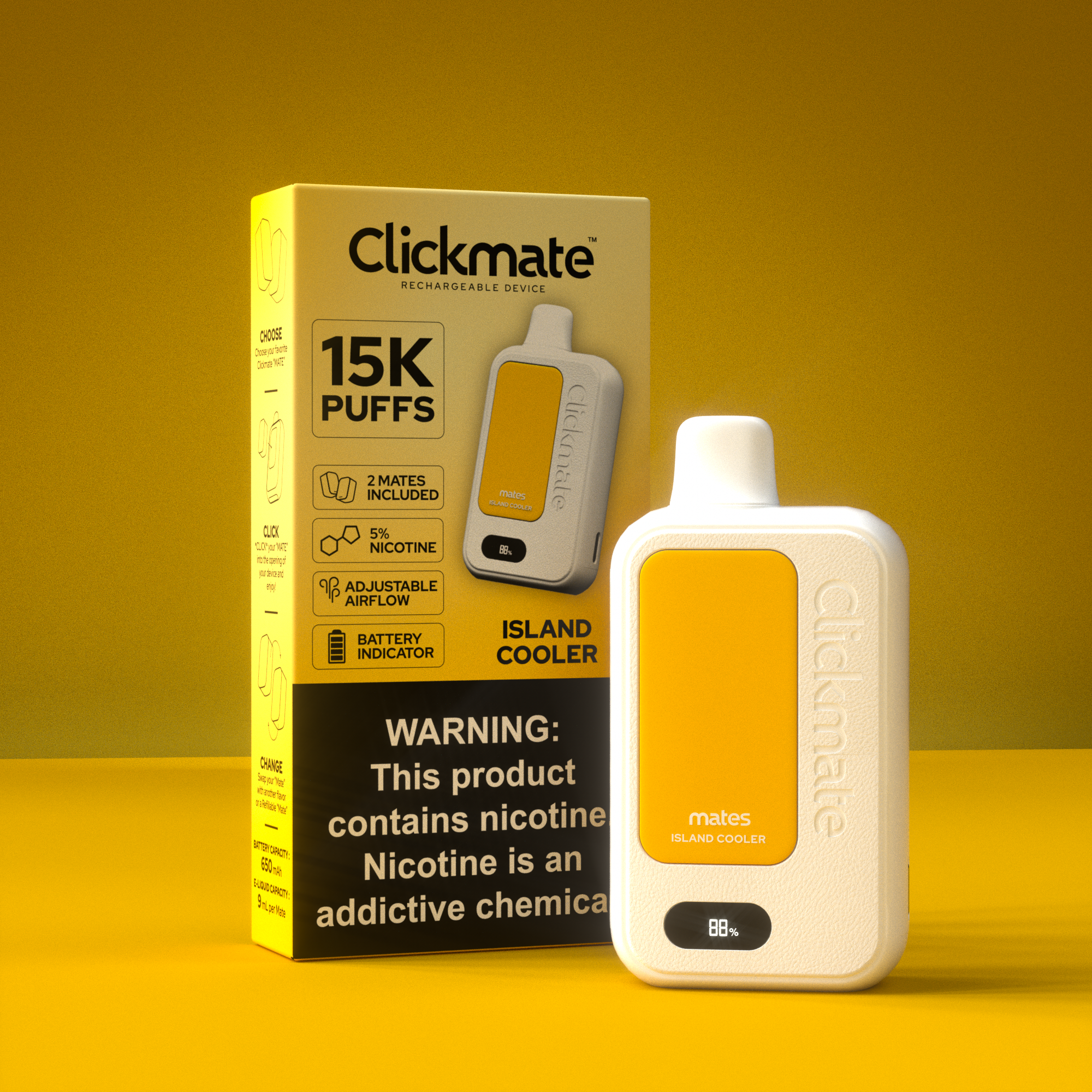
ISLAND COOLER
-
![]()
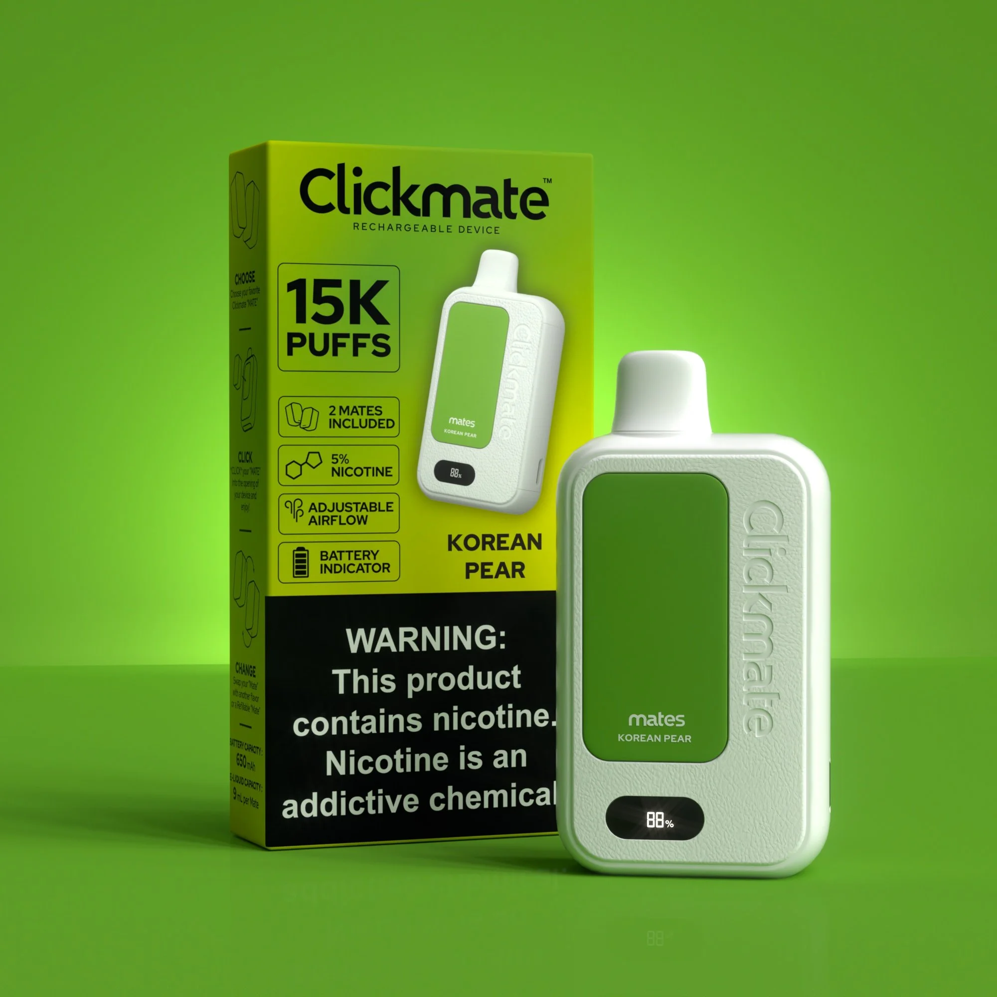
KOREAN PEAR
-
![]()
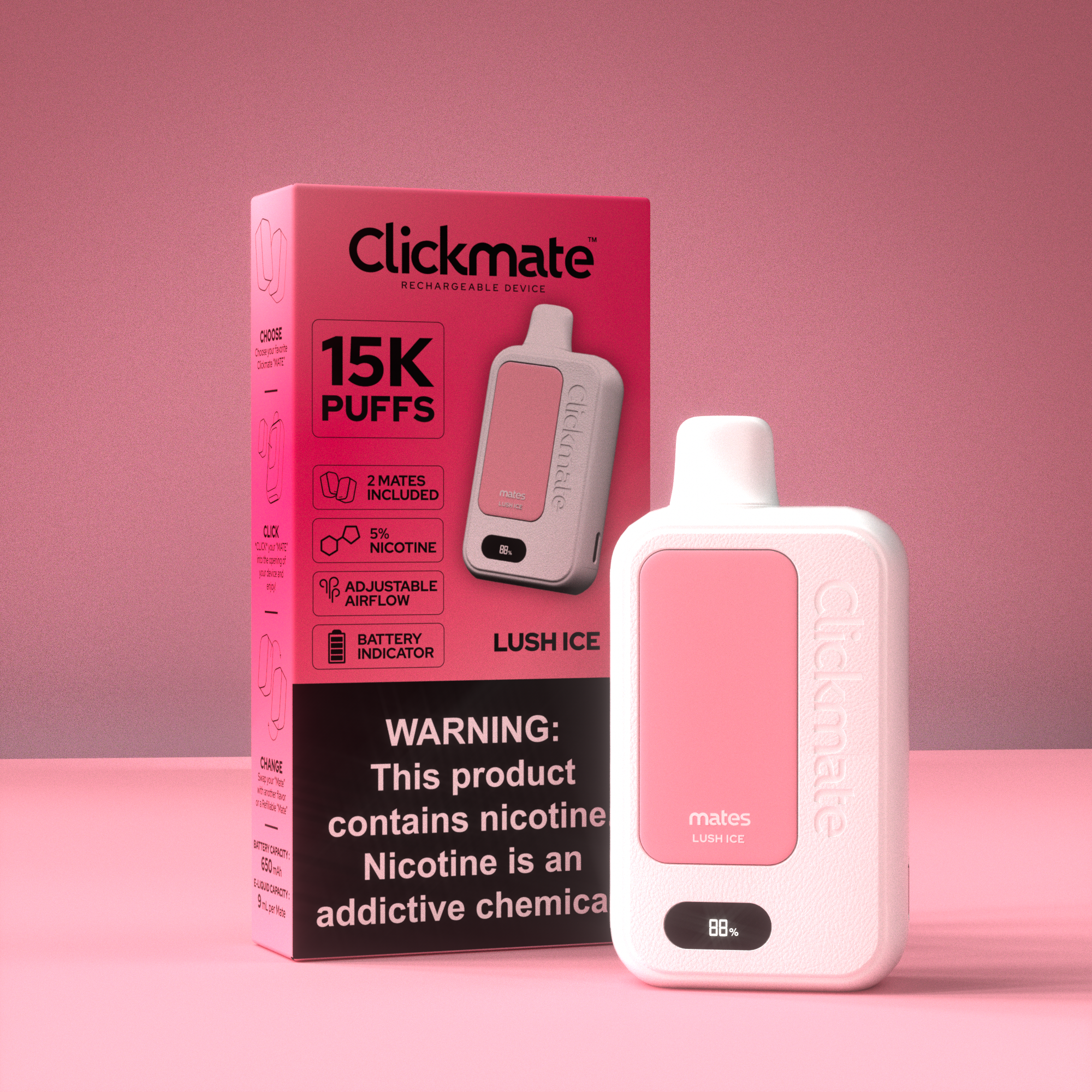
LUSH ICE
-
![]()
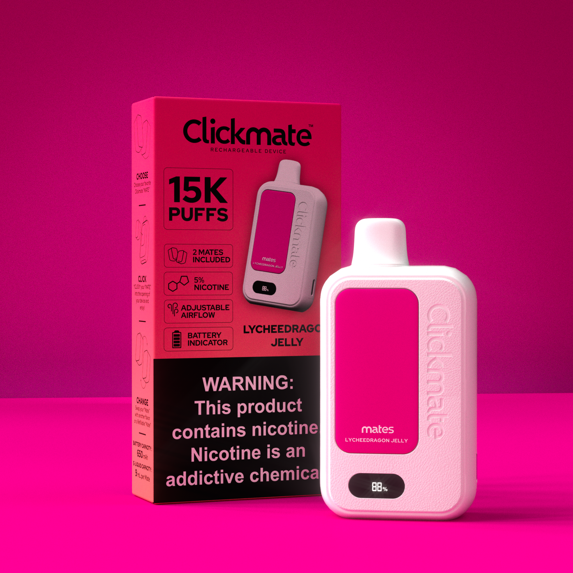
LEYCHEEDRAGON JELLY
-
![]()
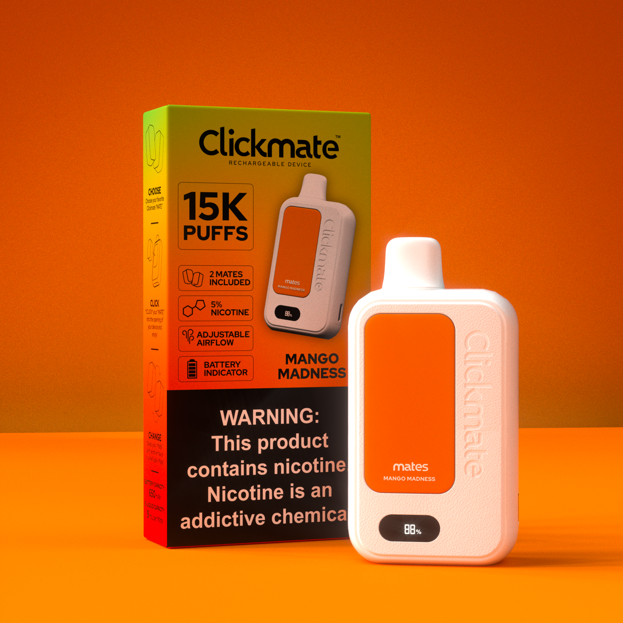
MANGO MADNESS
-
![]()
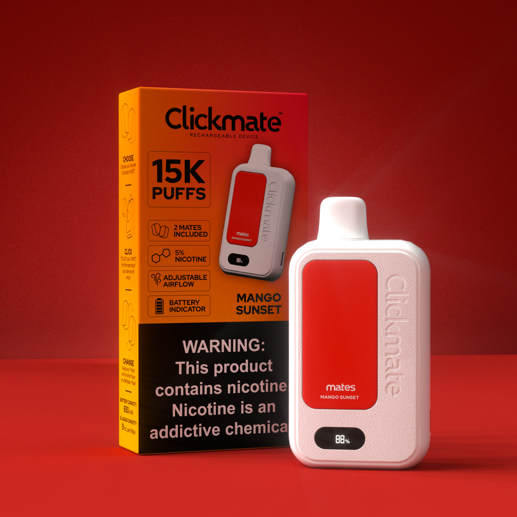
MANGO SUNSET
-
![]()
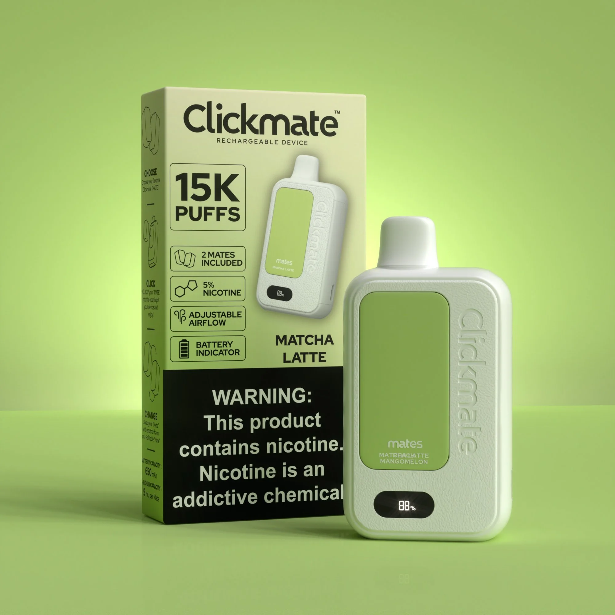
MATCHA LATTE
-
![]()
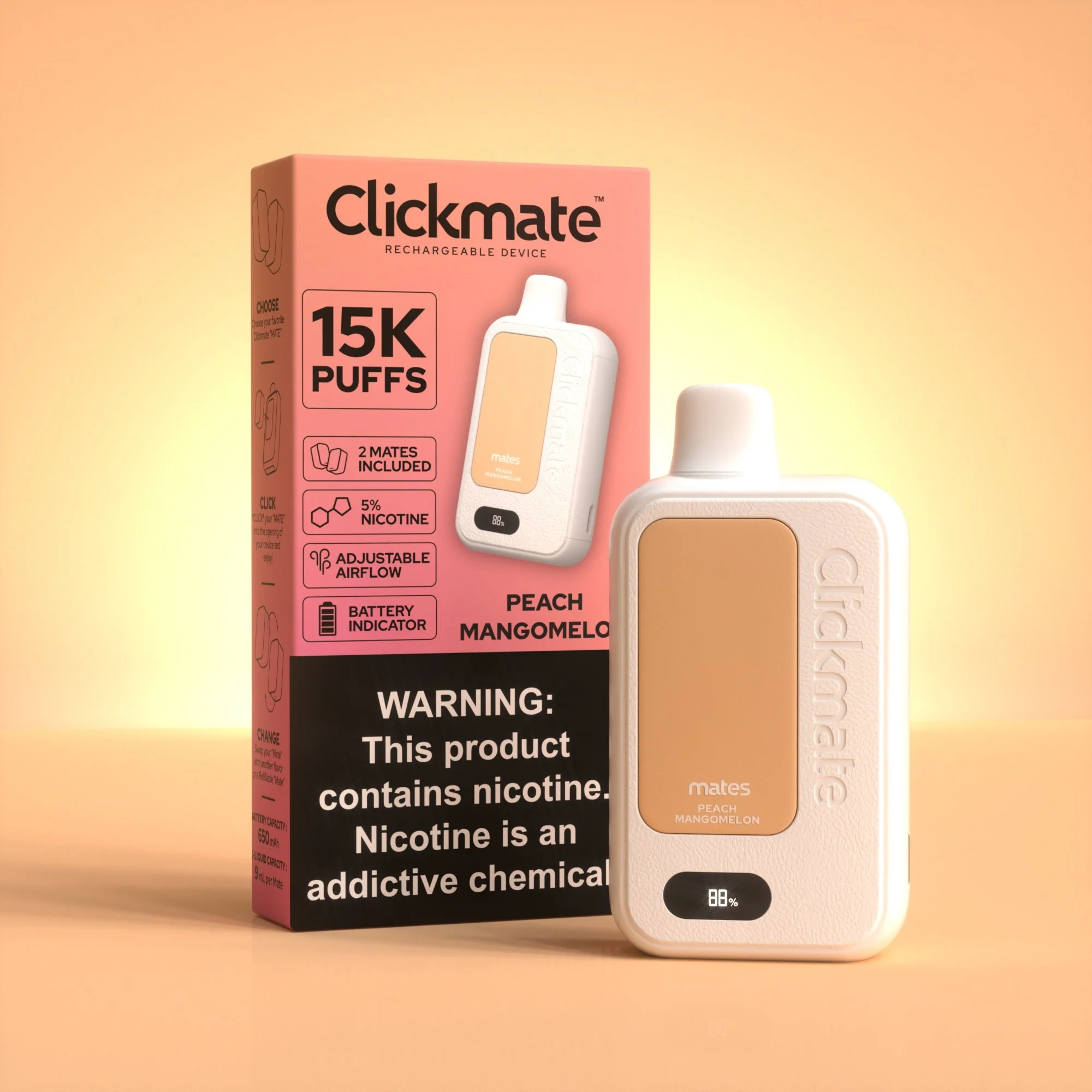
PEACH MANGMELON
-
![]()
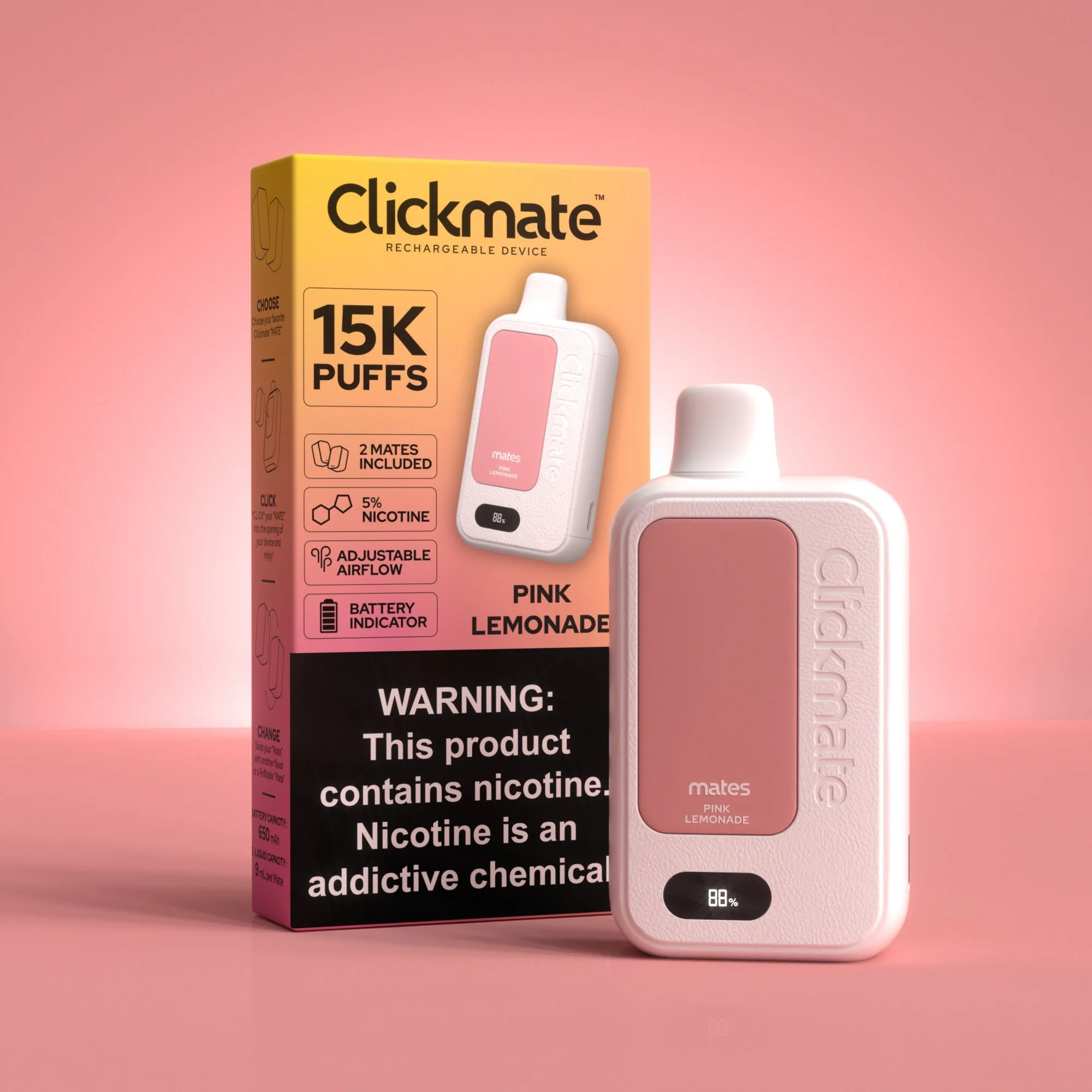
PINK LEMONADE
-
![]()
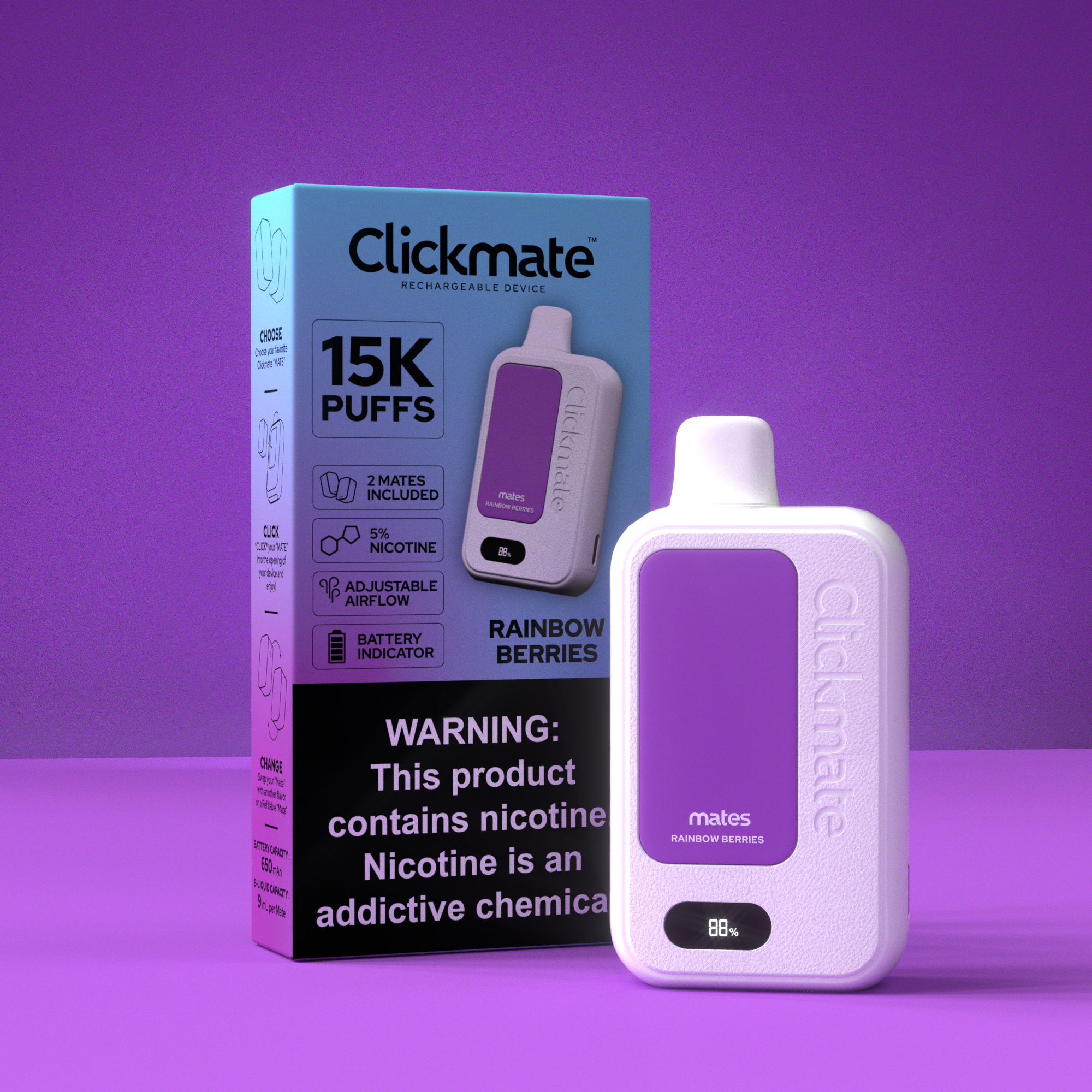
RAINBOW BERRIES
-
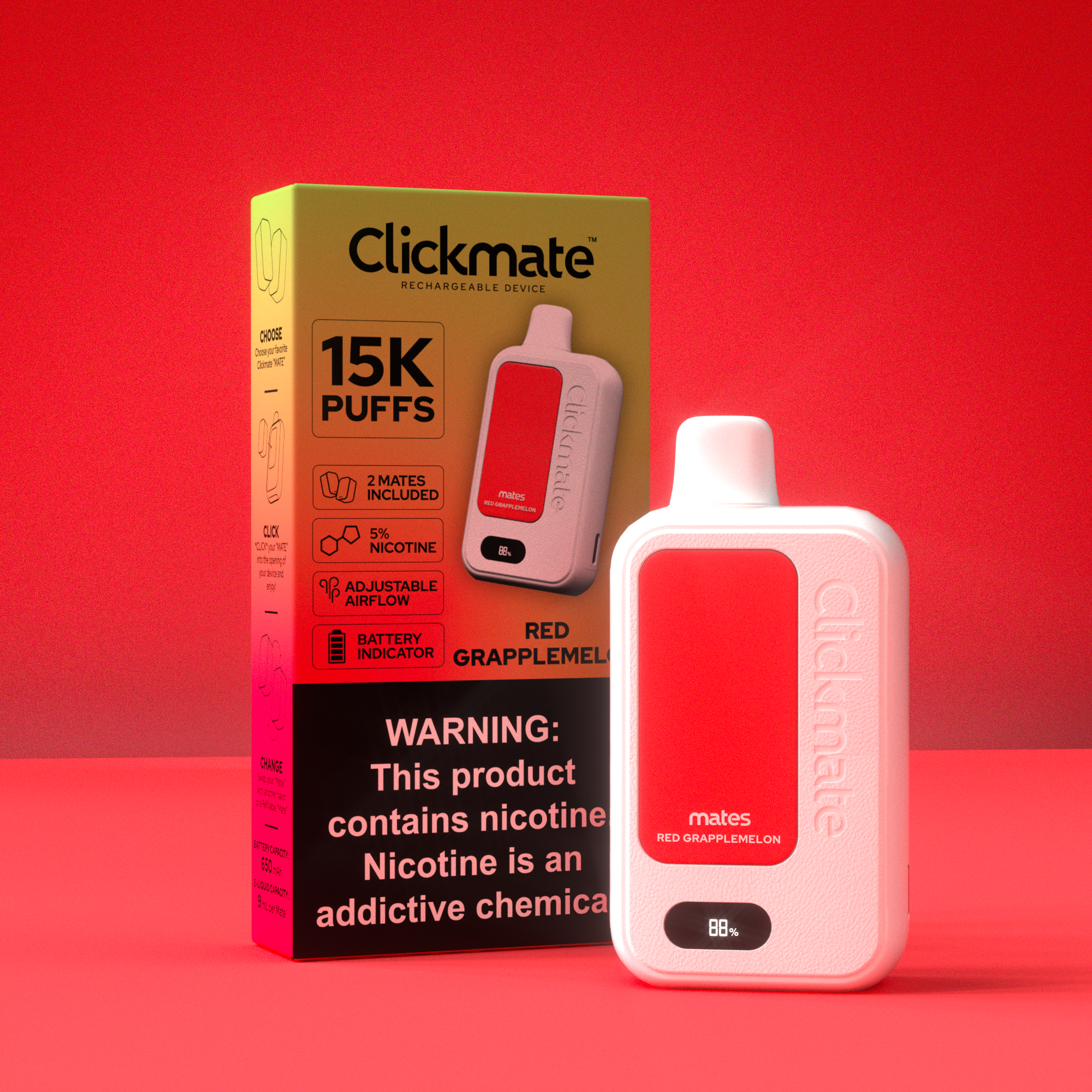
![RED GRAPPLEMELON]()
New List Item
-
![]()
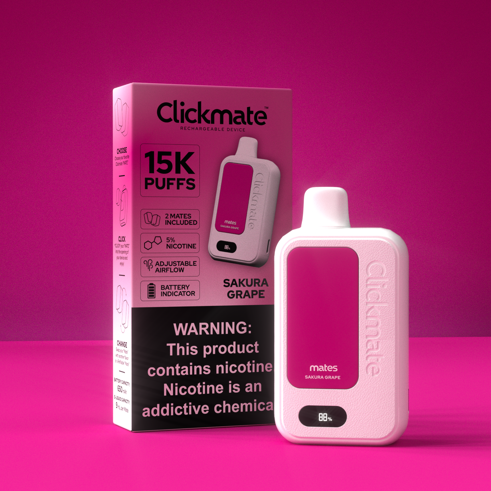
SAKURA GRAPE
-
![]()
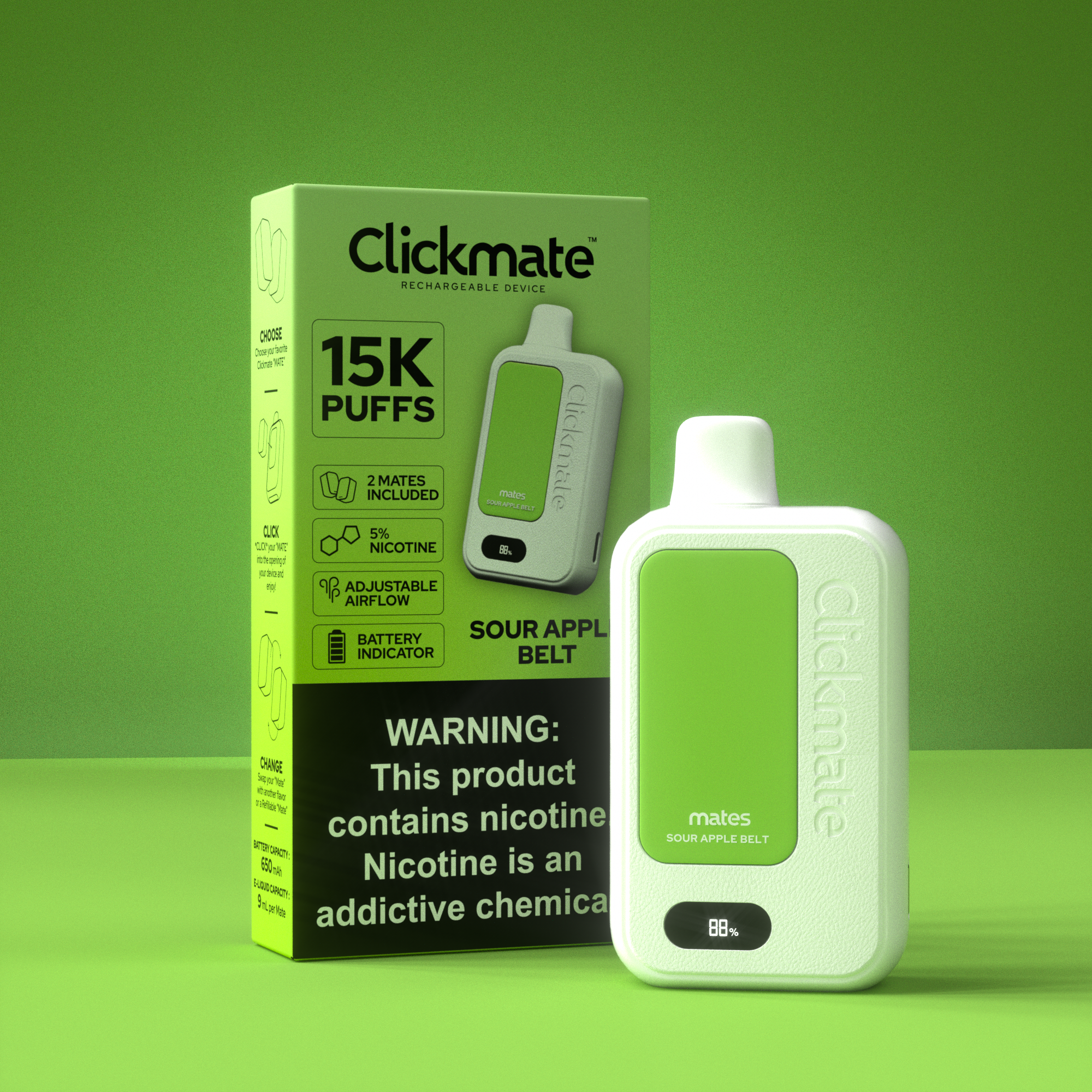
SOUR APPLE BELT
-
![]()
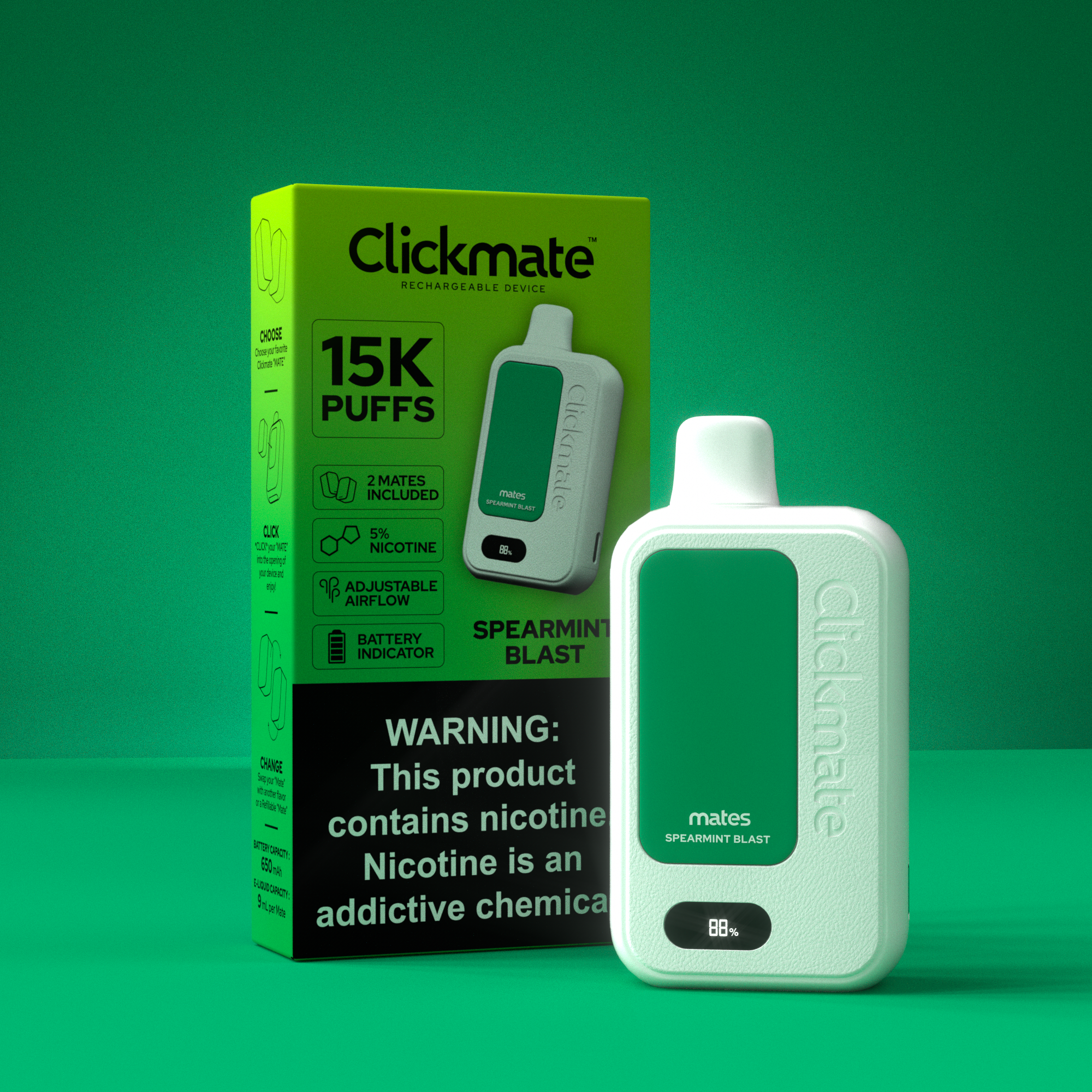
SPEARMINT BLAST
-
![]()
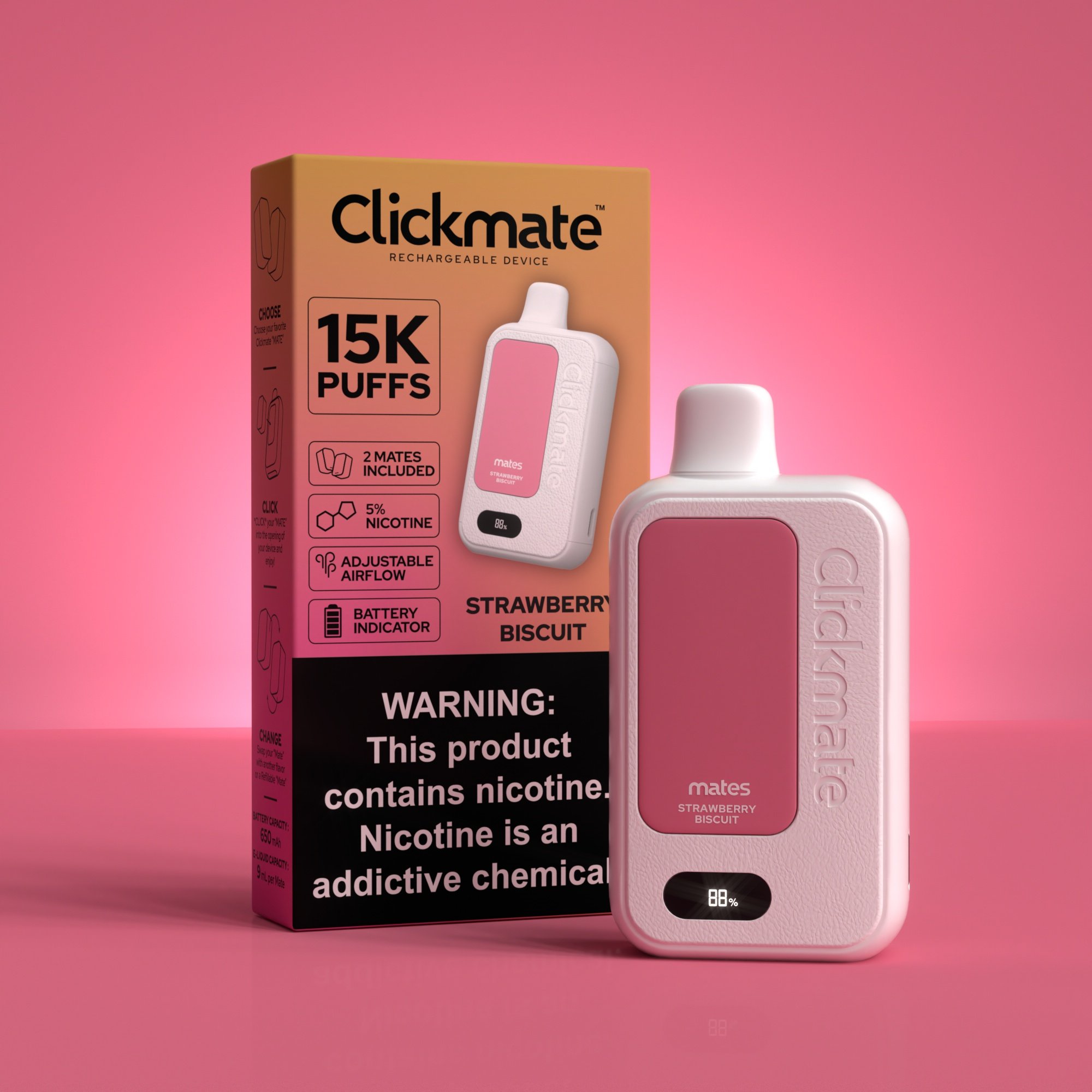
STRAWBERRY BISCUIT
-
![]()
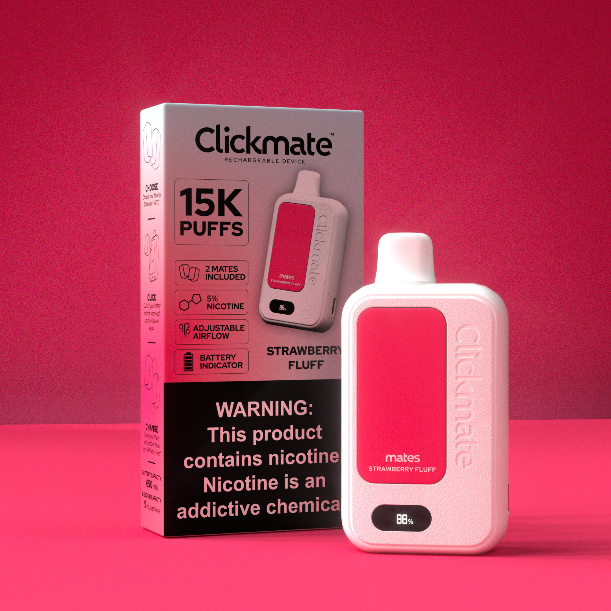
STRAWBERRY FLUFF
-
![]()
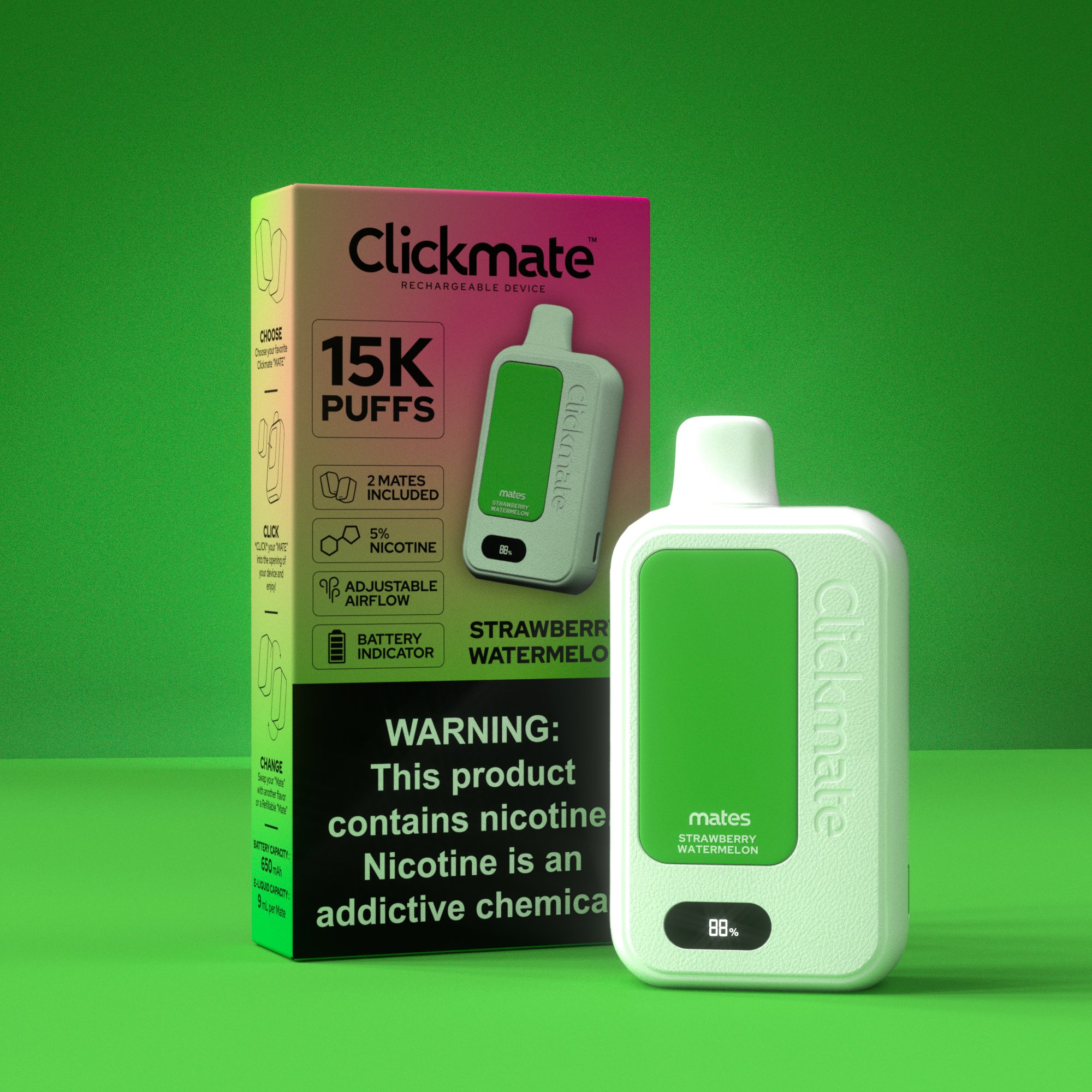
STRAWBERRY WATERMELON
CLICKMATE V2
-
![]()
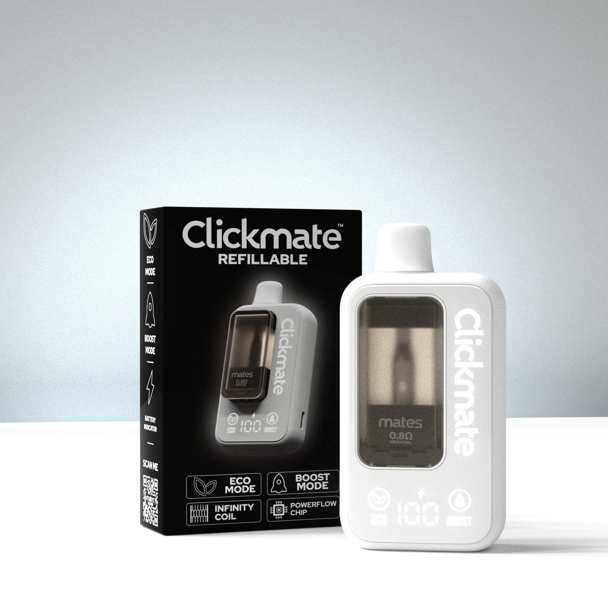
V2 REFILLABLE
POUCHMATES
-
![]()
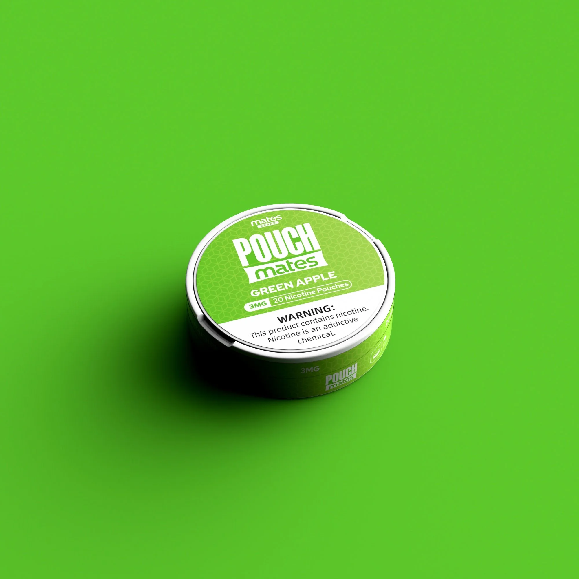
GREEN APPLE
-
![]()
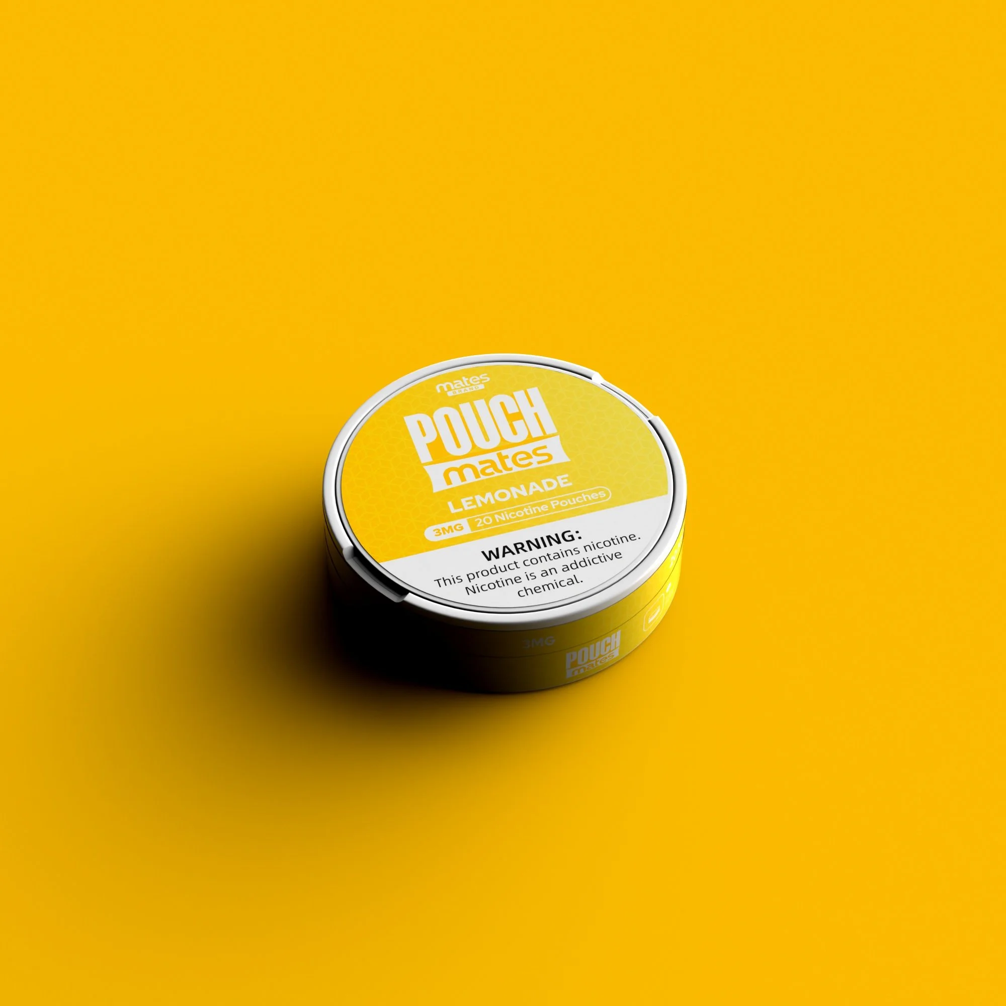
LEMONADE
-
![]()
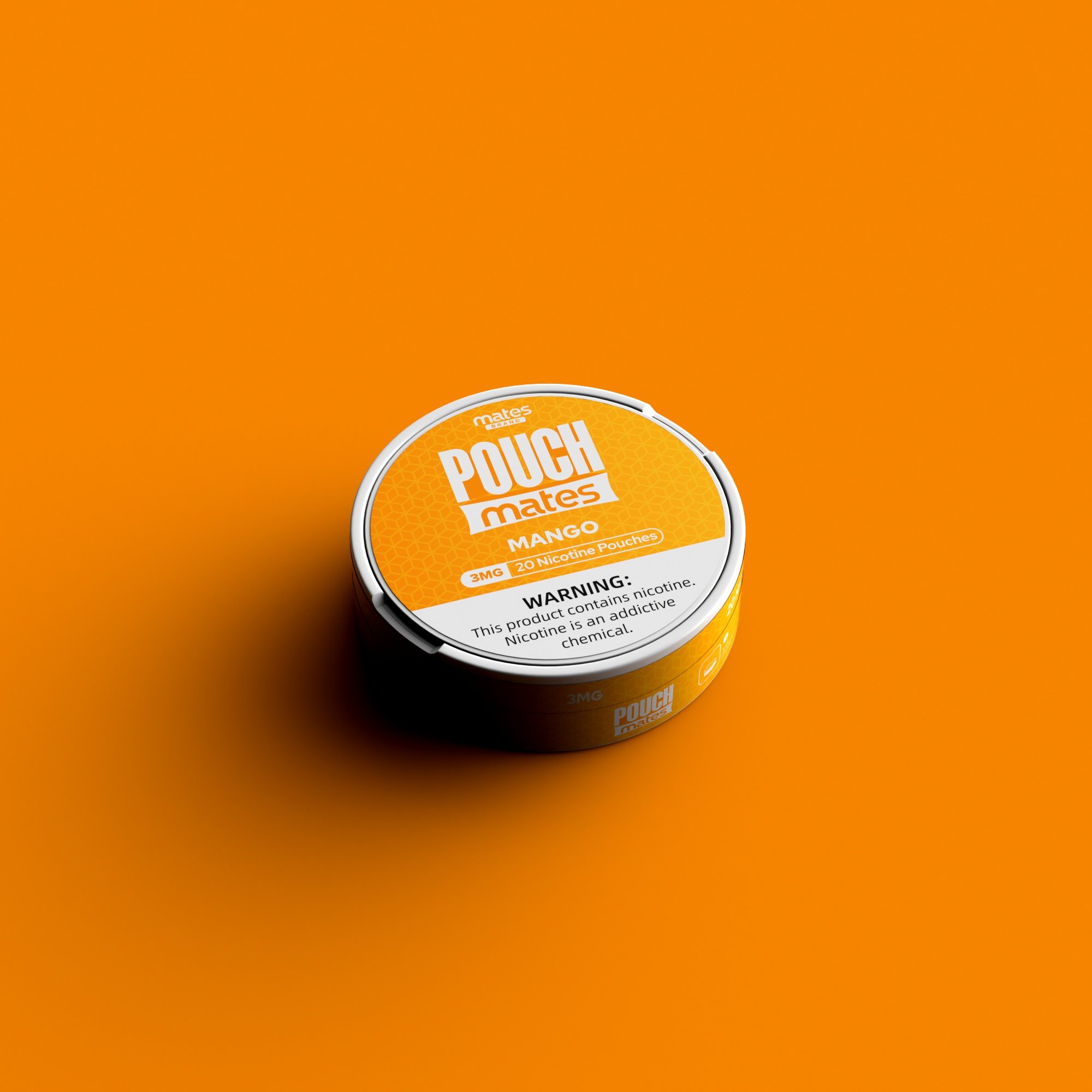
MANGO
-
![]()
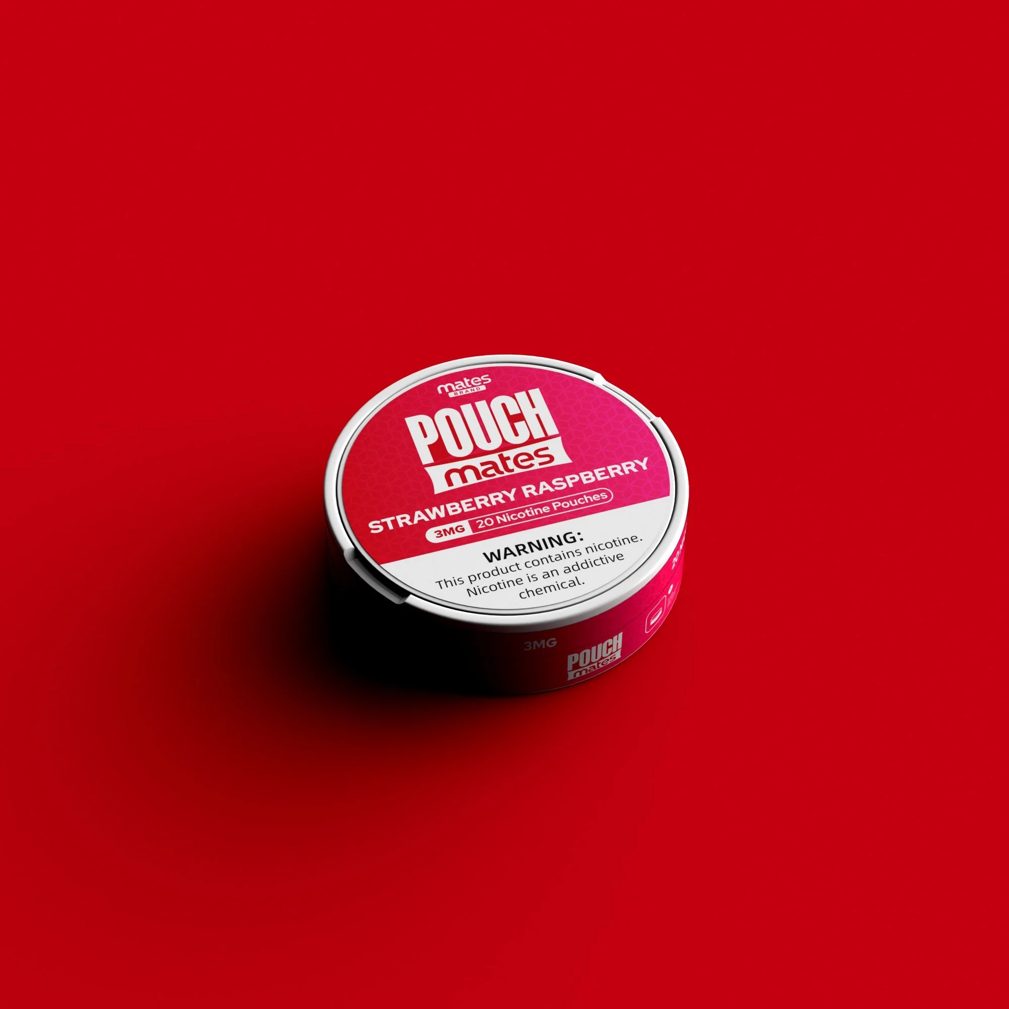
STRAWBERRY RASPBERRY
-
![]()
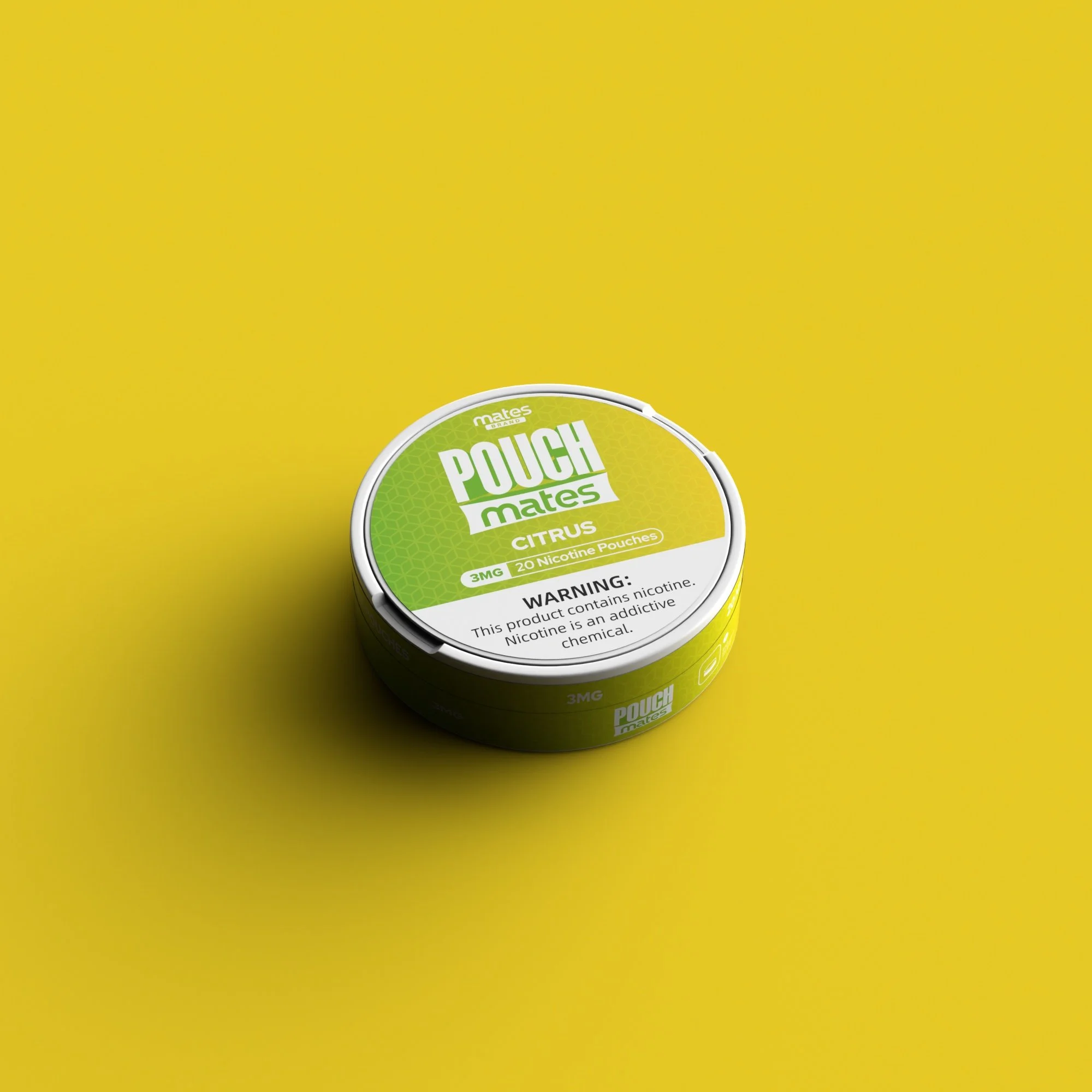
CITRUS
-
![]()
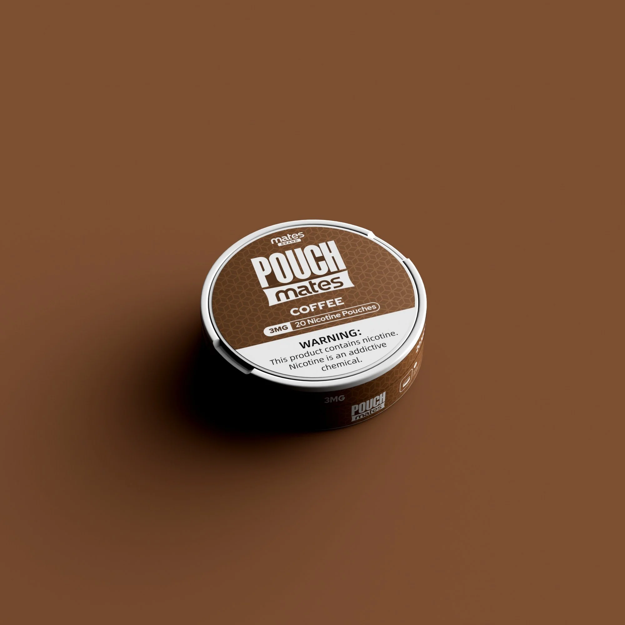
COFFEE
-
![]()
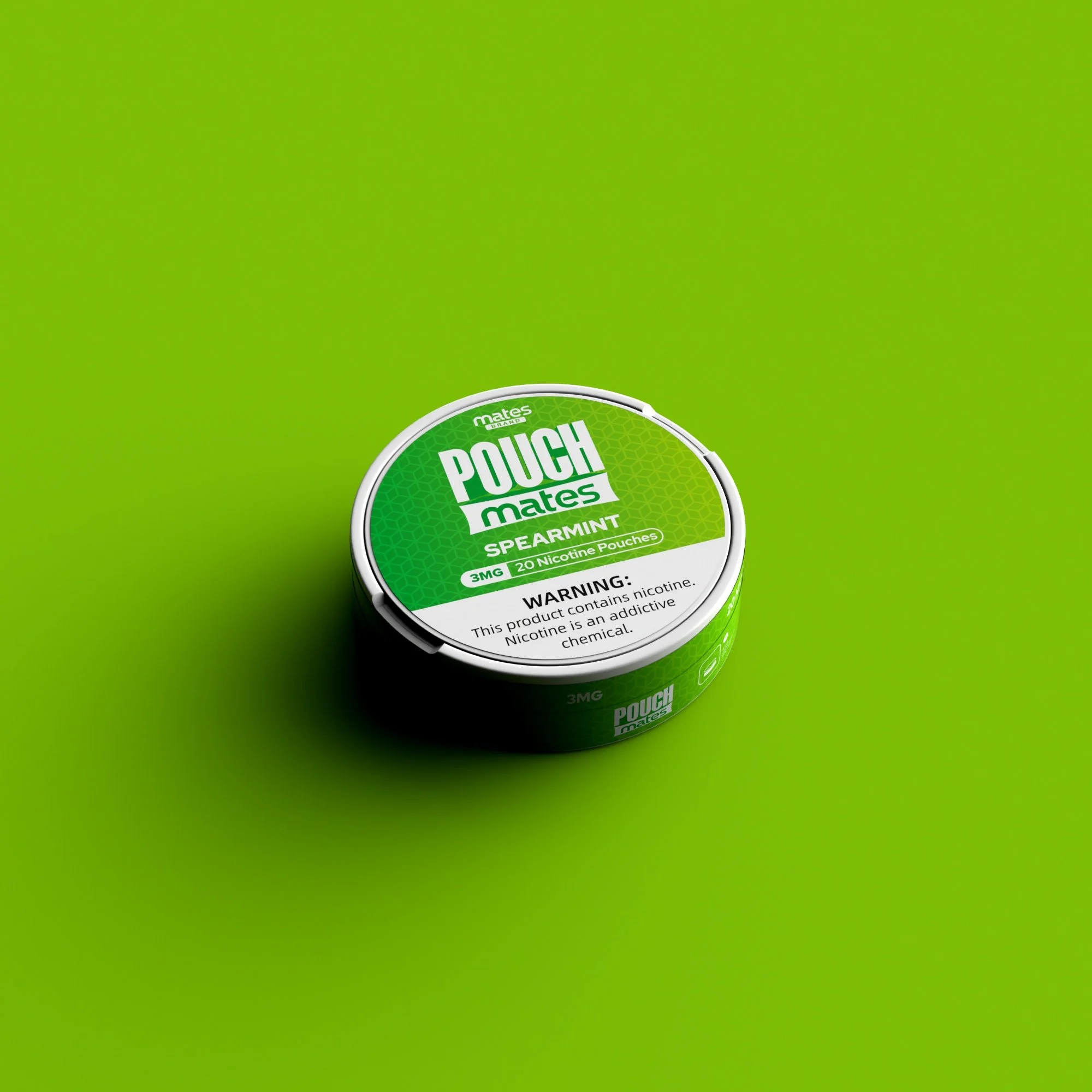
SPEARMINT
-
![]()
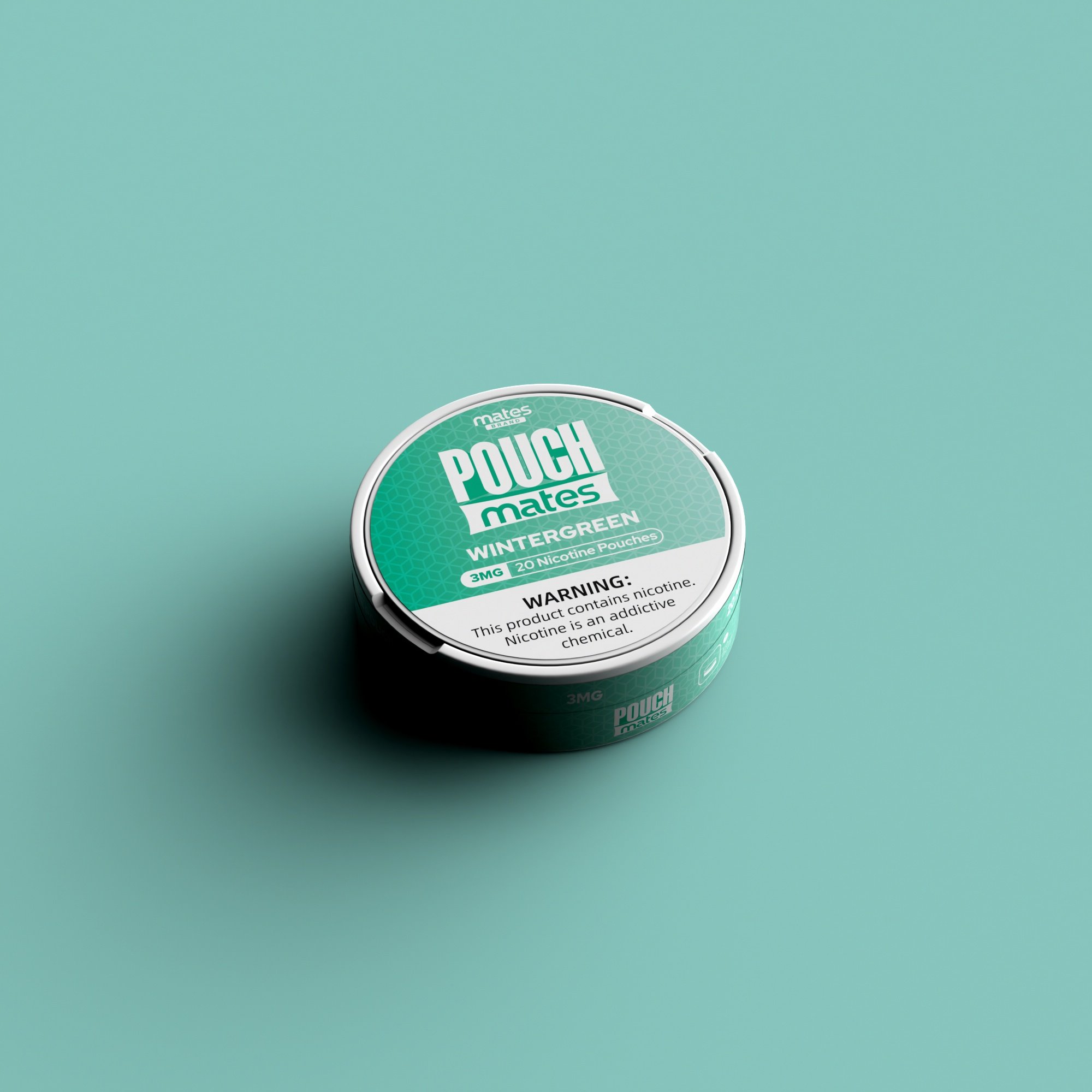
WINTERGREEN
MINTMATES
-
![]()
GREEN APPLE
-
![]()
LEMONADE
-
![]()
MANGO
-
![]()
STRAWBERRY RASPBERRY
-
![]()
CITRUS
-
![]()
COFFEE
-
![]()
SPEARMINT
-
![]()
WINTERGREEN
CONTENT