CABIN CREW 360-degree brand creation
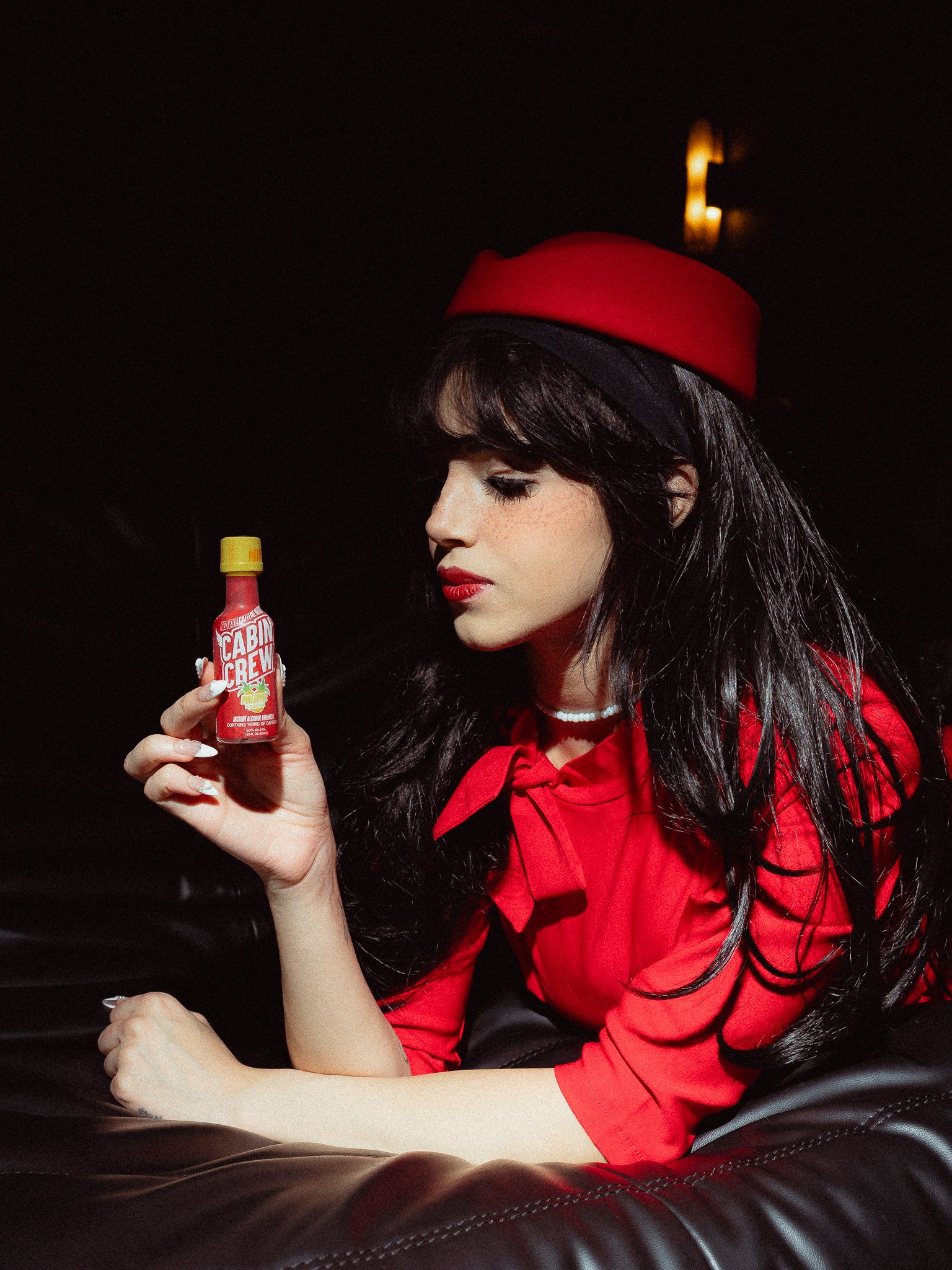
Cabin Crew is here to shake up the way you enjoy drinks. Inspired by the unapologetic glam and swagger of 1970s air travel, we’re serving first-class vibes to your cup. Just like the OG cabin crews who served up style and top-tier service, we’re on a mission to make every sip next level.
YEAR
2024
PROJECT DURATION
7 MONTHS
Naming Story
One of our designers originally suggested Cabin Crew as a nod to the cozy cabin-in-the-woods vibe. a place where good drinks and good company go hand in hand. But as soon as we heard it, our minds went somewhere else: the airline cabin. Tiny bottles. Mile-high drinks. Flight attendants with flair. That twist hit instantly. the name still captured the spirit of escape, but with a bold, cheeky aviation spin. From there, we dove into research, building an entire brand world around retro travel, freedom, and that first-class energy. Cabin Crew was officially cleared for takeoff.
Research.
The visual direction for Cabin Crew began with a deep dive into vintage airline branding, retro travel posters, and aviation uniforms from the golden age of air travel. I studied how nostalgic design elements could be reimagined for a modern, nightlife-focused audience. Bold typography, cheeky taglines, and a confident red color palette were selected to evoke both flirtiness and authority. The goal was to create a brand that instantly felt iconic, playful enough for parties, but polished enough to feel premium. Every detail, from the mascot styling to the label layout, was informed by this balance of nostalgia and edge.

This was our first tradeshow
The official launch of Cabin Crew.
Brand Identity
Color
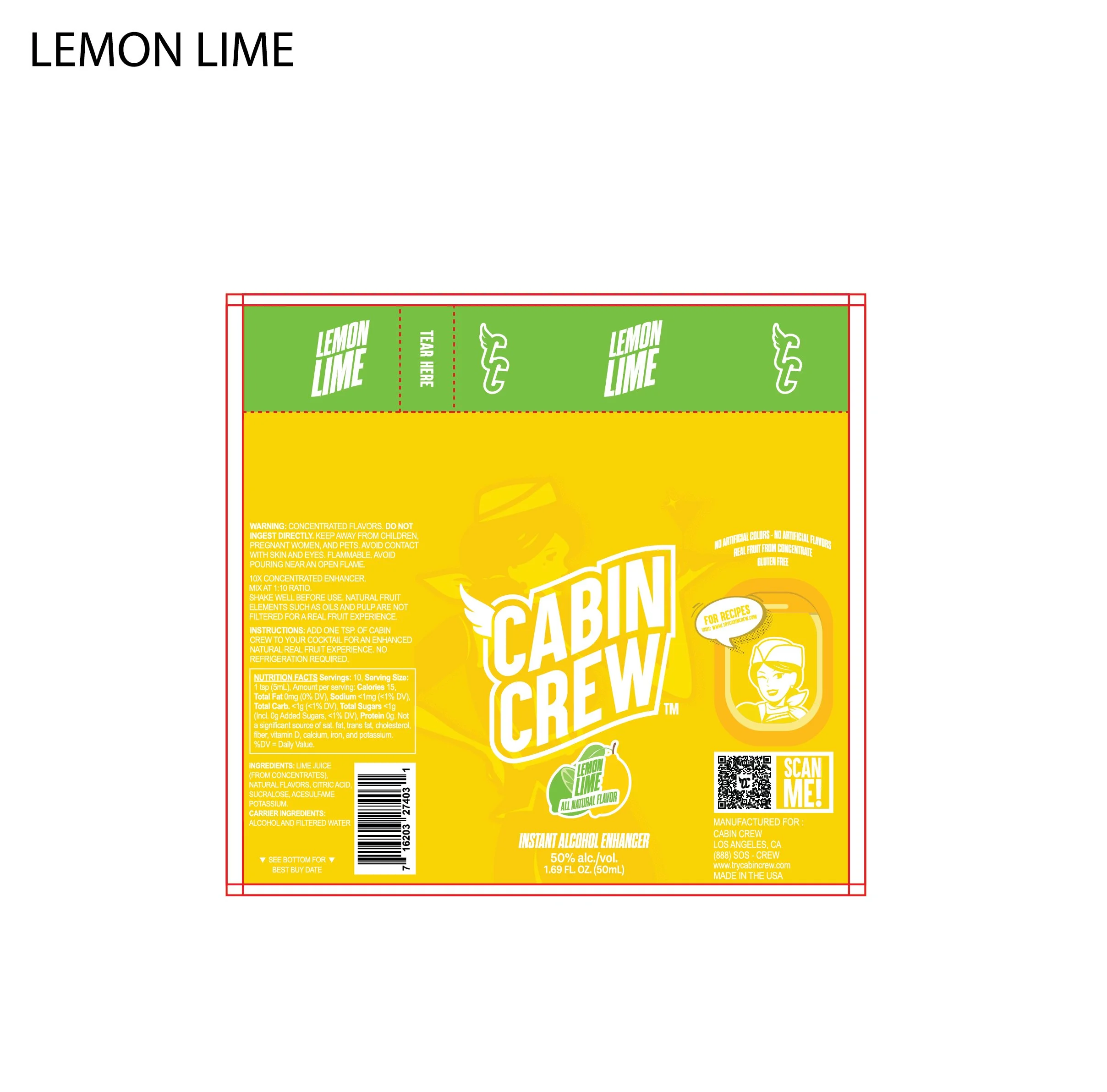
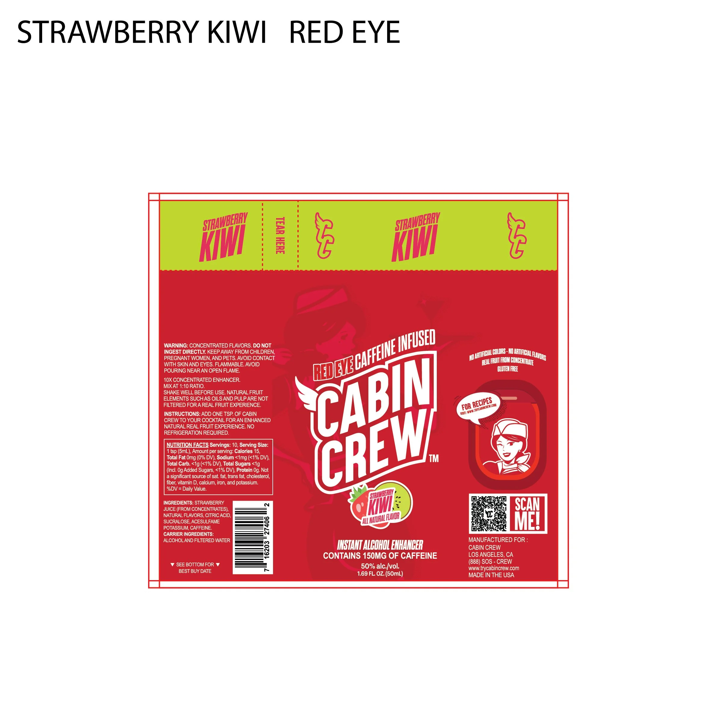
this bold, punchy red for Cabin Crew because it instantly commands attention just like the brand. The shade (#D80000) sits perfectly between retro and modern, evoking classic airline aesthetics (think vintage stewardess uniforms and boarding signs) while still feeling vibrant and youthful. Red also signals energy, confidence, and intensity everything Cabin Crew stands for. It’s not just a color; it’s an attitude. On shelf or screen, this red cuts through the noise and leaves a lasting impression.

Typography
For Cabin Crew, I chose Aku & Kamu as the primary display font because of its bold, expressive character that feels playful yet confident exactly the tone the brand carries. It has a retro charm that nods to vintage airline posters but with a modern edge that fits today’s nightlife and festival culture. For paragraph text, I paired it with Steve Sans, a clean, versatile sans-serif that provides clarity and balance. It keeps the layout readable without stealing attention, letting the visuals and headlines do the talking while maintaining a sleek, premium feel across the brand.


MASCOT
The first sketch of our mascot, Cici, was inspired by vintage pin-up posters, infused with the charm and elegance of 1960s Pan Am flight attendant uniforms.


LOGOS
-

MAIN
-

MASCOT
-

MONOGRAM
-

WORKMARK
LABELS
-
![]()
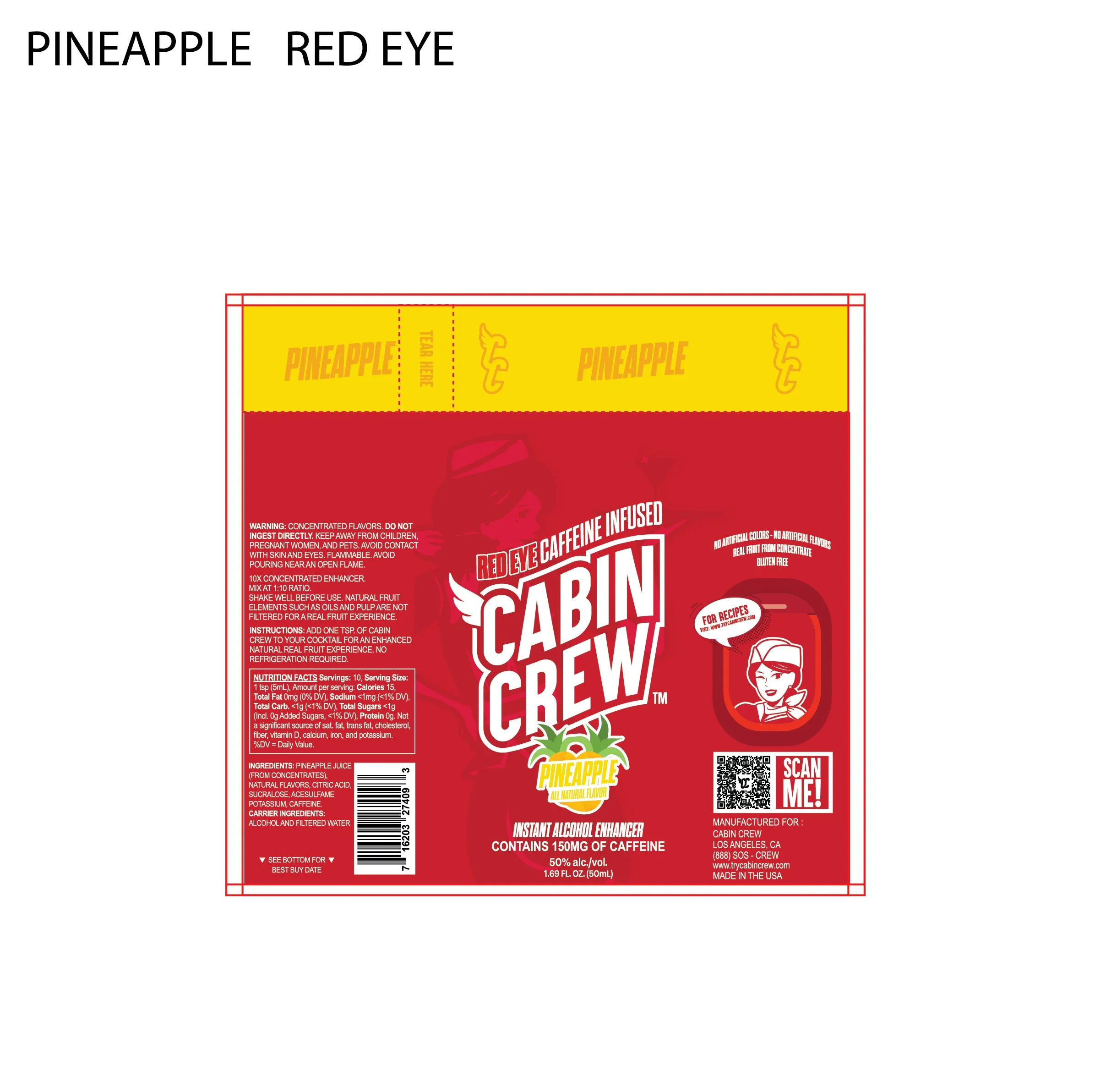
PINEAPPLE
-
![]()
LEMON LIME
-
![]()
STRAWBERRY KIWI
-
![]()
CHERRY LIMEADE
-
![]()
RED EYE STRAWBERRY KIWI
-
![]()
RED EYE CHERRY LIMEADE
-
![]()
RED EYE PINEAPPLE
-
![]()
LEMON LIME


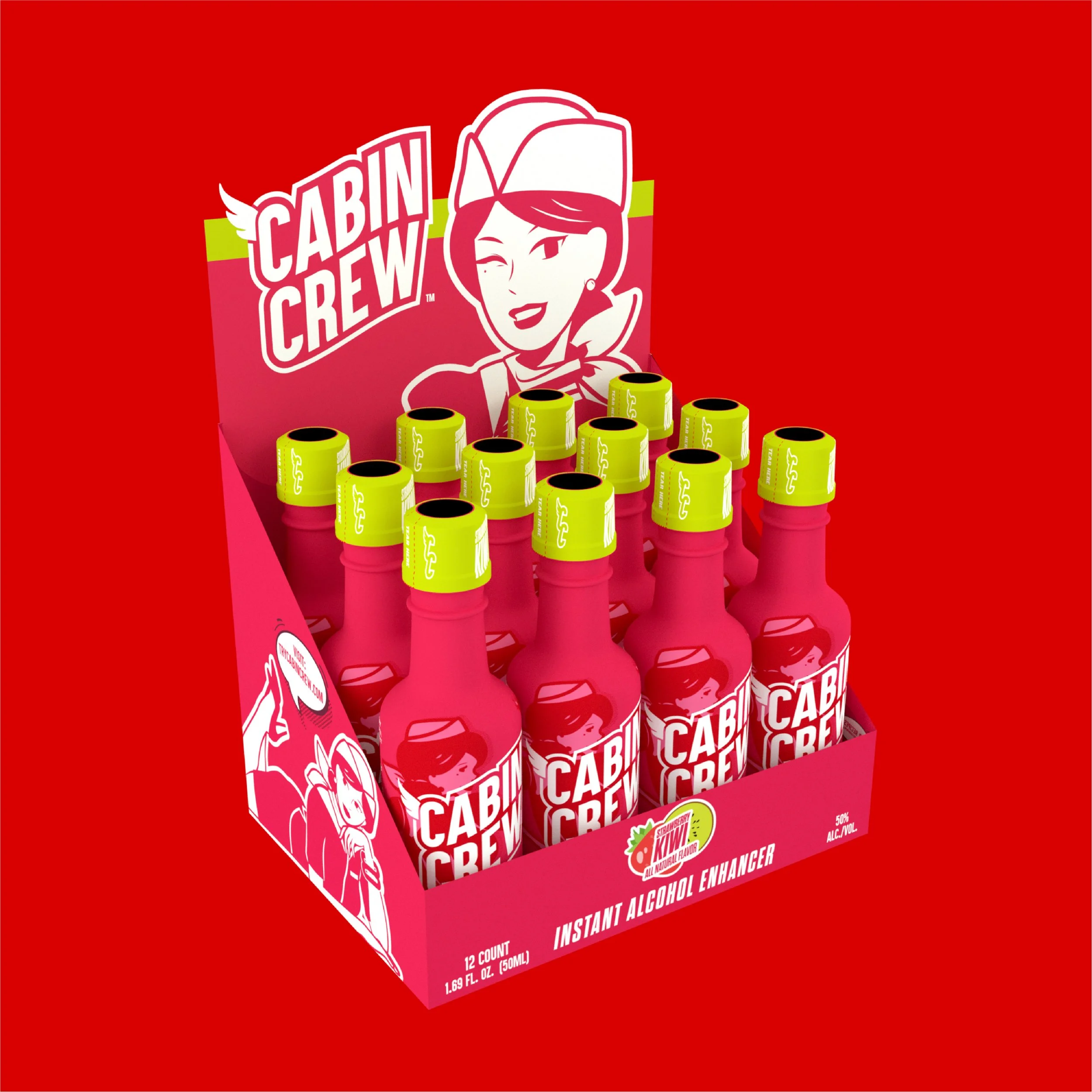
12 PACKS BOX
-
![]()
PINEAPPLE
-
![]()
STRAWBERRY KIWI
-
![]()
CHERRY LIMEADE
-
![]()
RED EYE STRAWBERRY KIWI
-
![]()
RED EYE CHERRY LIMEADE
-
![]()
RED EYE PINEAPPLE


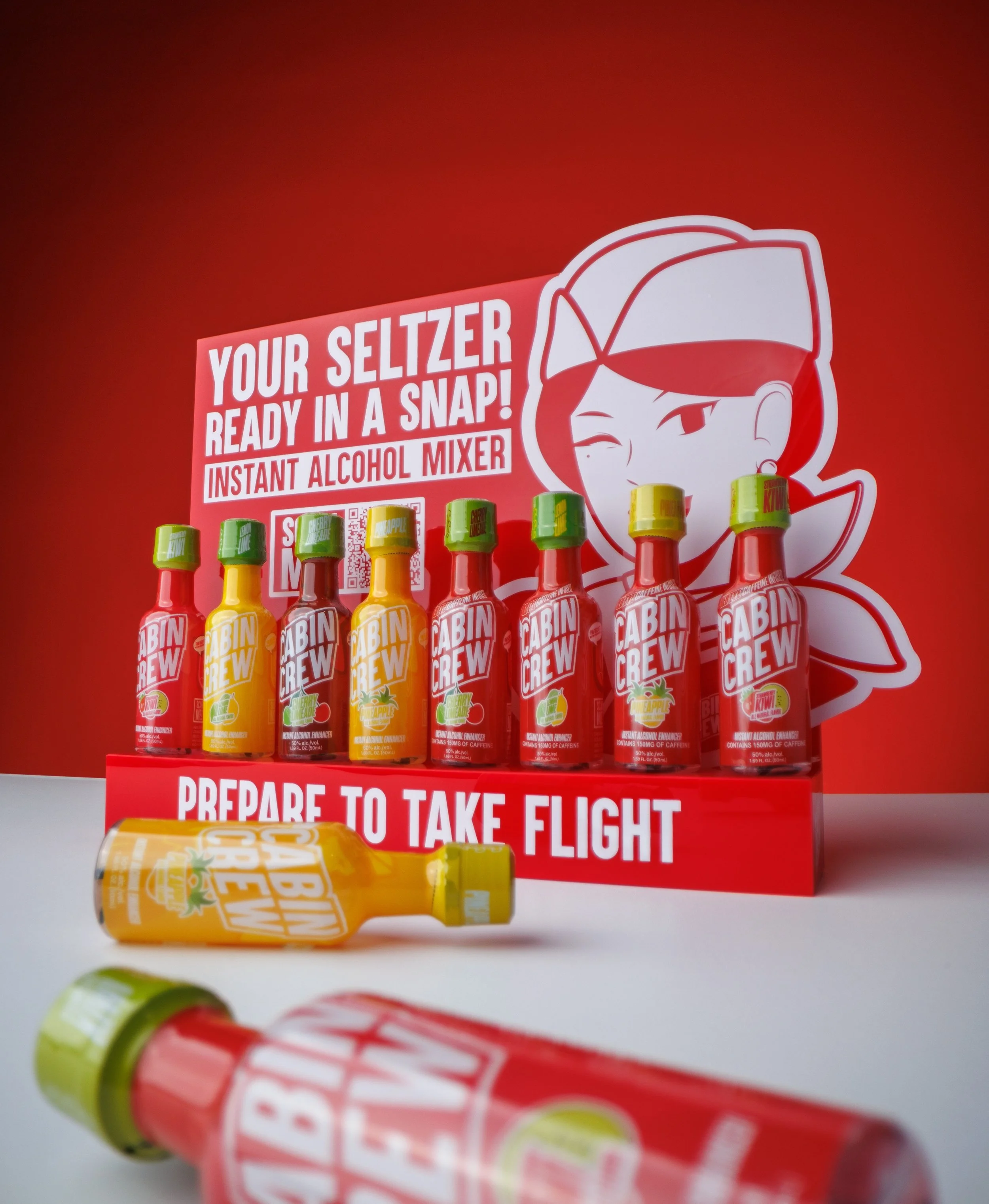
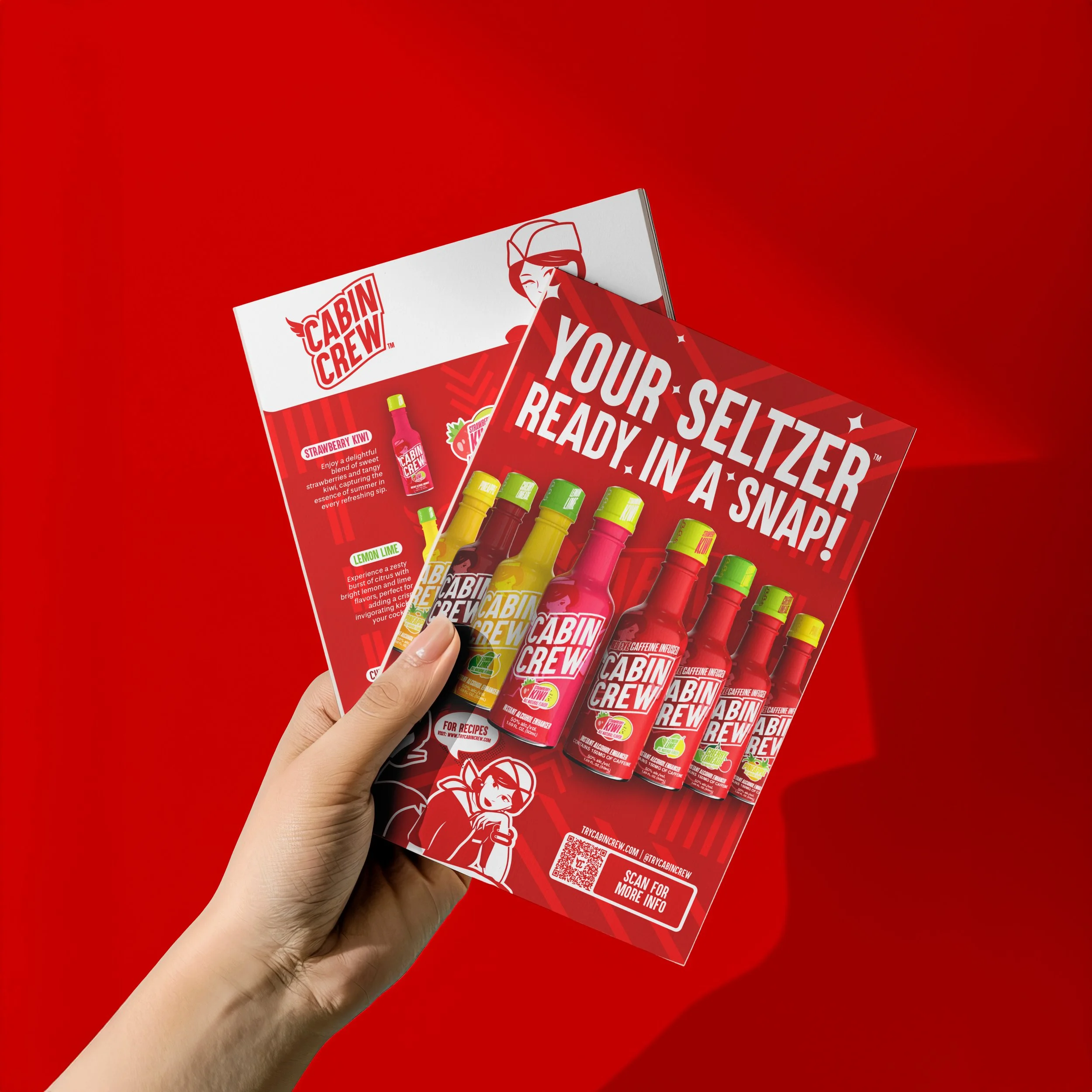
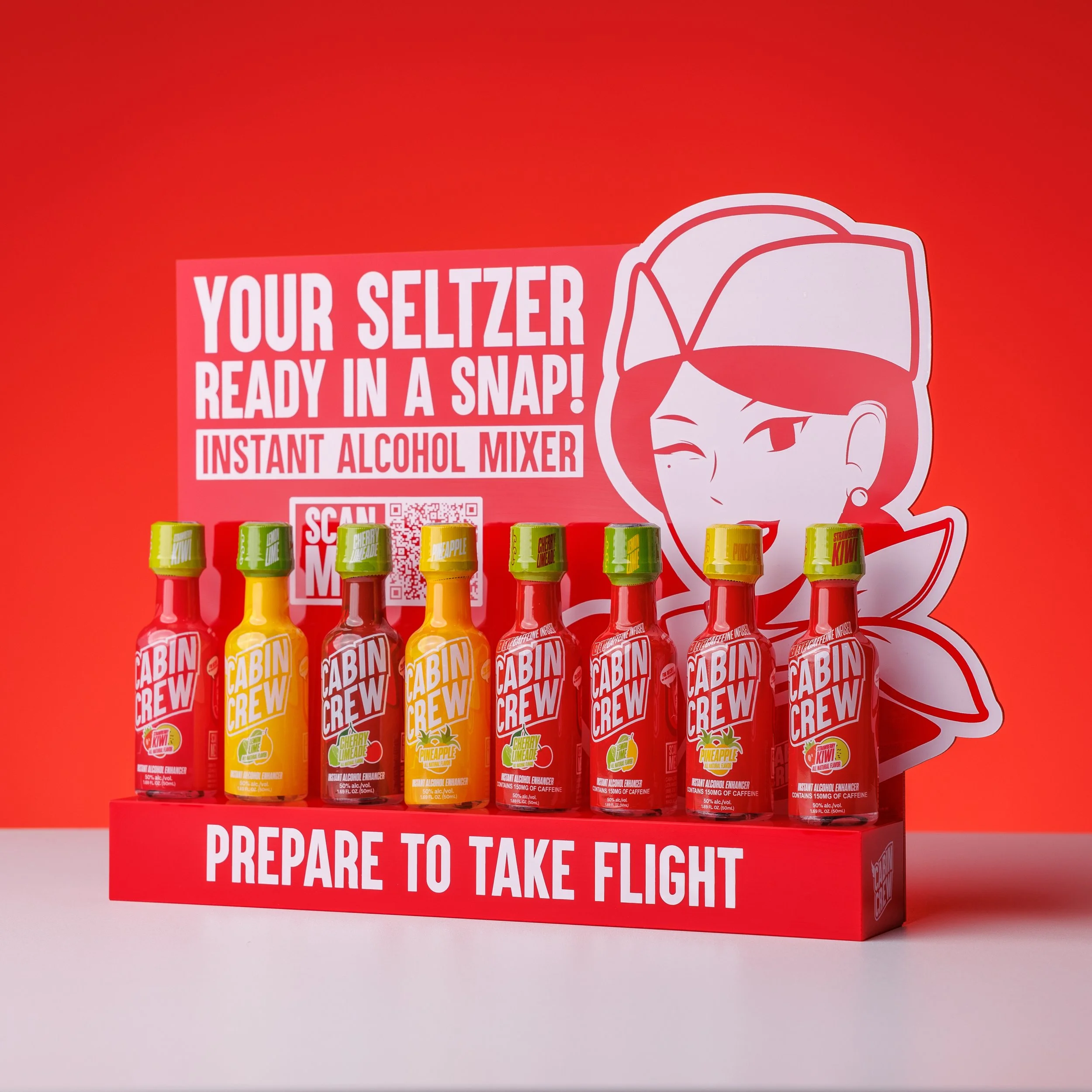
Marketing materials
-
![]()
FLAVOR MENU
-
![]()
CO2 GAS CONTAINER
-
![]()
COCKTAIL SHAKER
-
![]()
DISPLAY STAND
-
![]()
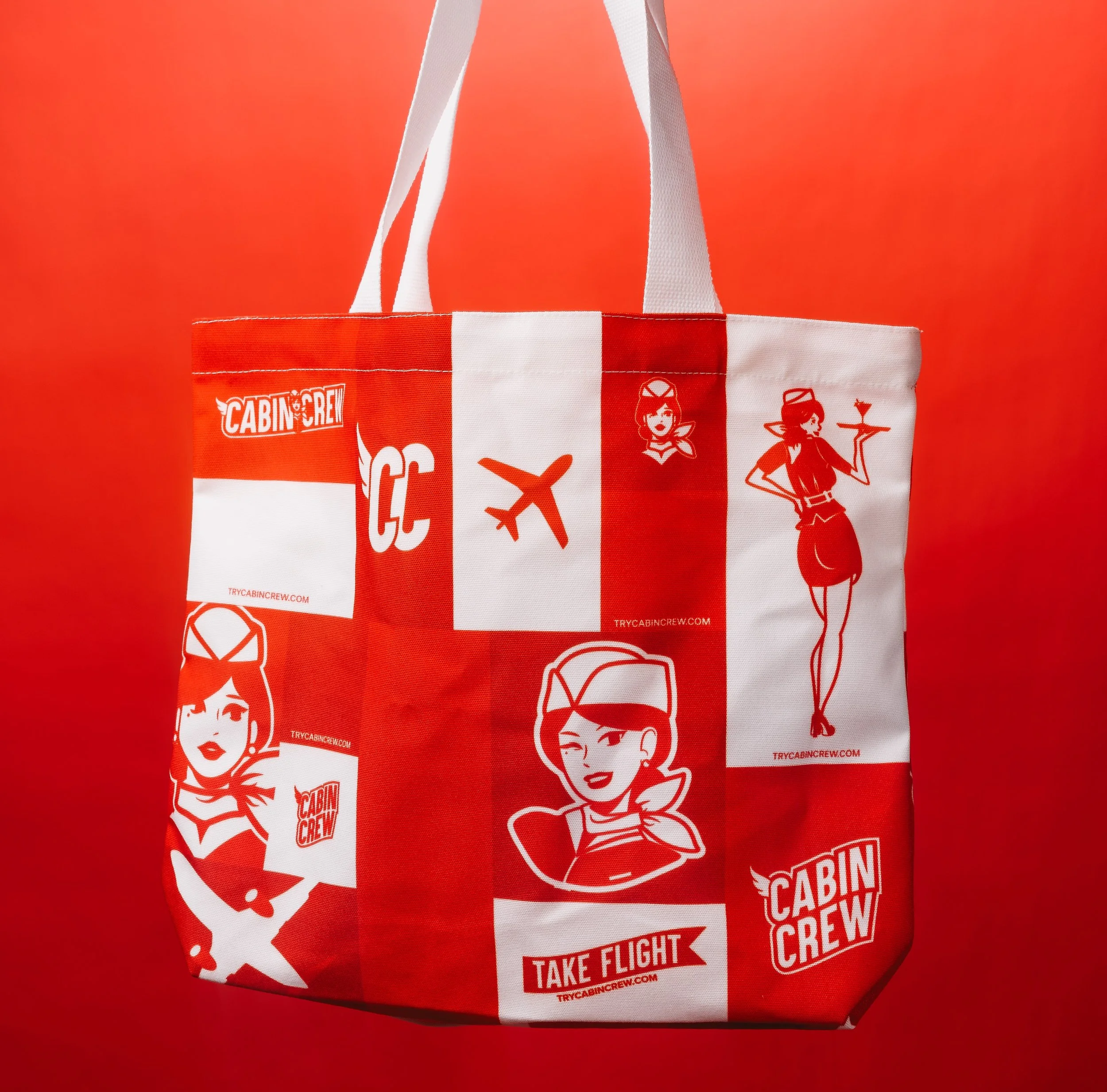
TOTE BAG
-
![]()
METAL KEYCHAIN
-
![]()
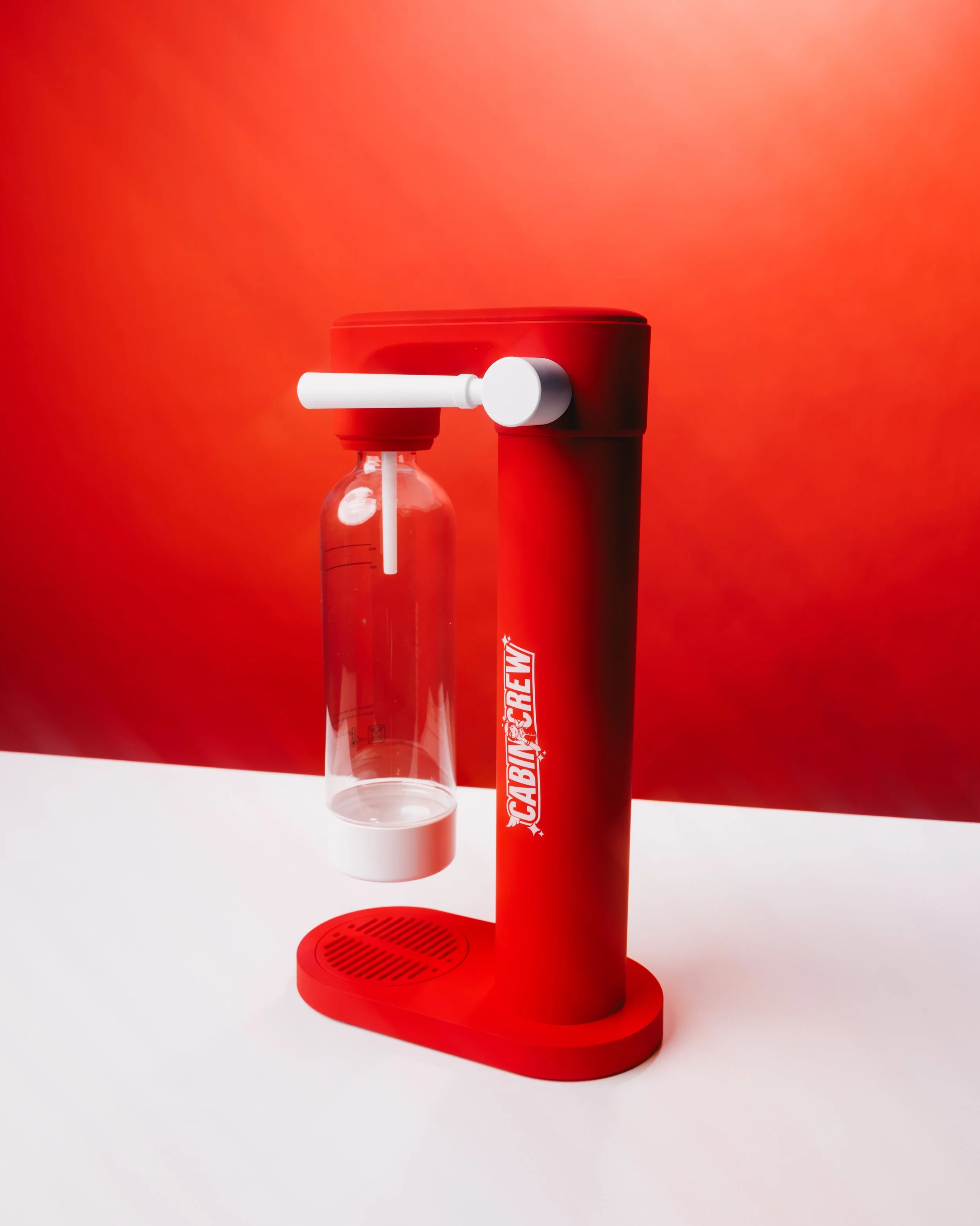
SODA STREAM
-
![]()
RED HAT
-
![]()
BLACK HAT
-
![]()
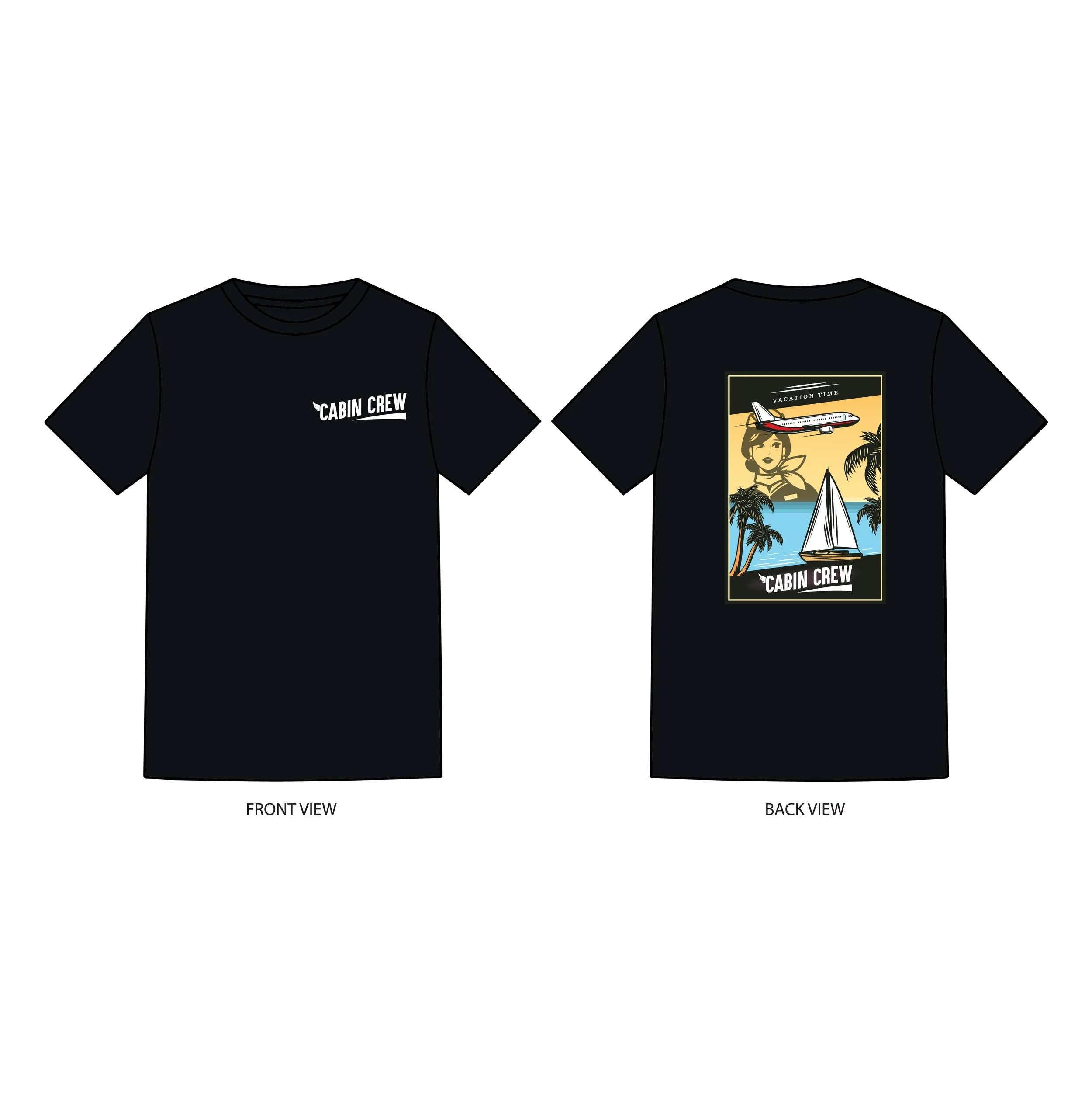
T-SHIRT 1
-
![]()
T-SHIRT 2
-
![]()
T-SHIRT 3


BRANDING AND MARKETING GUIDE
CONTENT